
Sometimes the distance between a product and its packaging is difficult to name. The formula has been refined. The collection has grown. You have a clearer sense of who you want to reach. Yet the box in your hands still seems to belong to an earlier version of the business.
If that feeling is familiar, I would begin by giving it a little attention. What, exactly, feels out of step? The answer can tell us a great deal about where change belongs.
For me, this is one of the most interesting parts of design: looking closely enough to understand which details still hold meaning, and which ones are making it harder for the brand to move forward.
First, I would ask what has changed
Imagine a skincare brand that launched with three products and now has twelve. Each new formula has found a place in the collection, but the packaging has been adapted one product at a time. Colours are doing several jobs. Product names sit in different places. It takes a little too long to understand which bottle to choose.
In that situation, I would look at the relationships across the range. What should someone recognise first? What helps them distinguish one product from another? Can the next addition fit into the same visual language?
A different situation needs different questions. Perhaps the range is still small, but the brand now speaks to a more specific audience. Or its approach to sourcing has evolved, while the packaging still tells the original story. Before choosing a colour or a typeface, I want to understand that shift.
Then, I would look for what deserves to stay
There can be a lot of affection in a first identity. It belongs to the moment you decided to bring something into the world. It may also contain details that your customers already recognise: a particular colour, an illustration, the shape of a label.
I would want to know which of those details still feel true. Which ones help people find you? Which ones carry a story you want to keep telling?
Those answers give the design somewhere to begin. A familiar colour might stay while the typography becomes clearer. An illustration might find a more considered place. Change can build on the recognition you have already earned.
Knowing when to bring in a designer
That transition was part of the story behind both MISEICO and Okoko Cosmetiques. Both had begun with branding they had created themselves. As their businesses evolved, they reached a point where working with a specialist felt like the next step towards a more professional identity, one they could feel confident growing into.
I have a lot of respect for that first chapter. Creating something yourself means making decisions, finding your feet and learning what matters to the people who choose your products. Those experiences give a rebrand something valuable to build on.
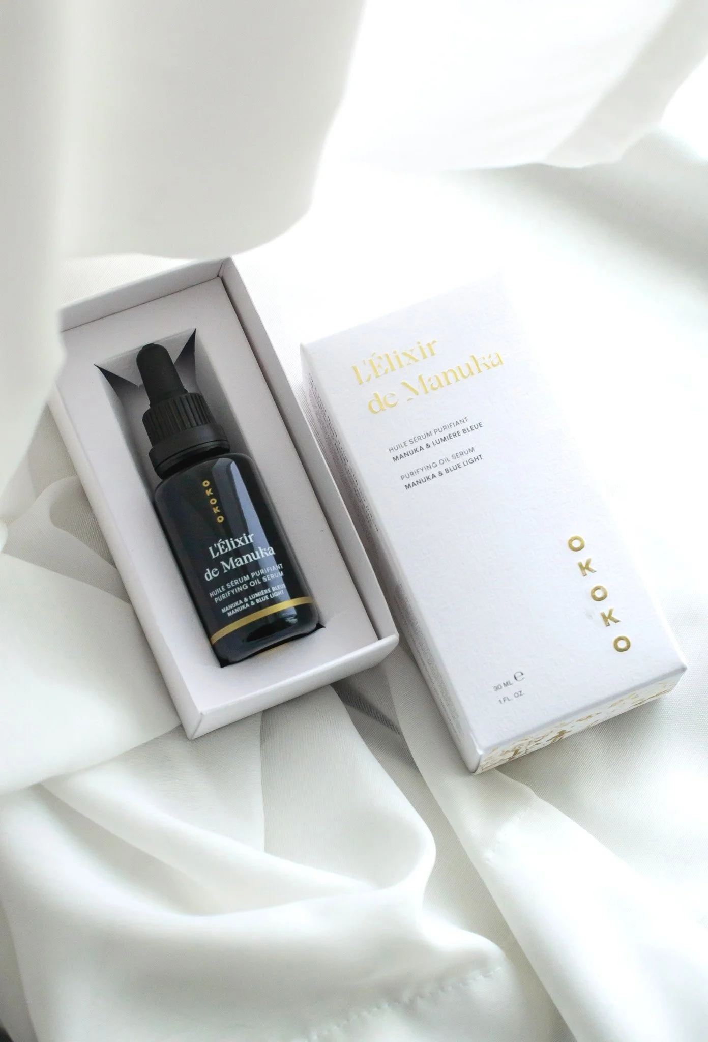
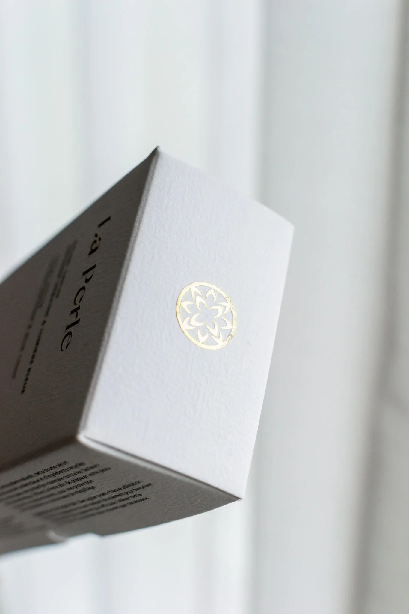
For MISEICO, the work brought the identity and packaging closer to the brand’s evolving values. We chose boxes made from 100% post-consumer paper and removed foil, letting the material and design carry the sense of care. For Okoko, we considered the whole packaging experience, from printing directly on the containers to adding texture through embossed boxes.
For me, these projects bring the question of professionalism down to the details. How does the range hold together? What does the material communicate? Does the packaging express the same care as the product inside? My role is to help those decisions work together, so the identity can reflect the business the founder has built.
MISEICO: before and after the rebrand
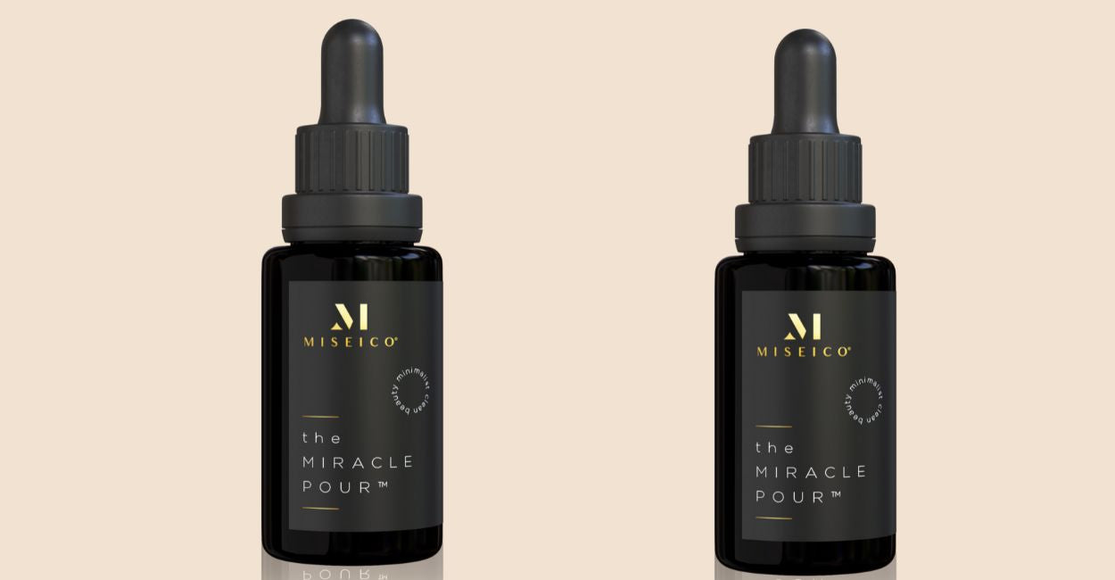
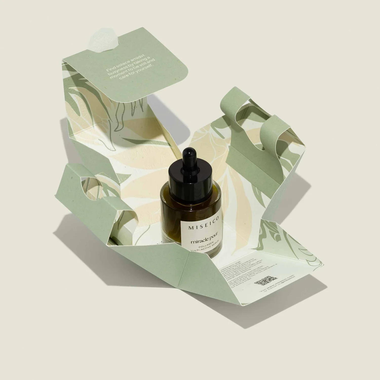
Looking at these two chapters together, I notice how much the material changes the feeling of the identity. The light label, muted green and folded paper create a different experience around the product. You can read more about the thinking behind the business in my conversation with Michelle, MISEICO’s founder.
Okoko: making the details work together
Looking at the whole family
For Appellation’s relaunch, we developed a packaging system in which the different product lines have their own motifs within a shared visual language. The design draws on Czech Art Deco and Japanese minimalism, connecting the founders’ heritage with the brand’s sensibility.
Appellation: two chapters of the Calm collection

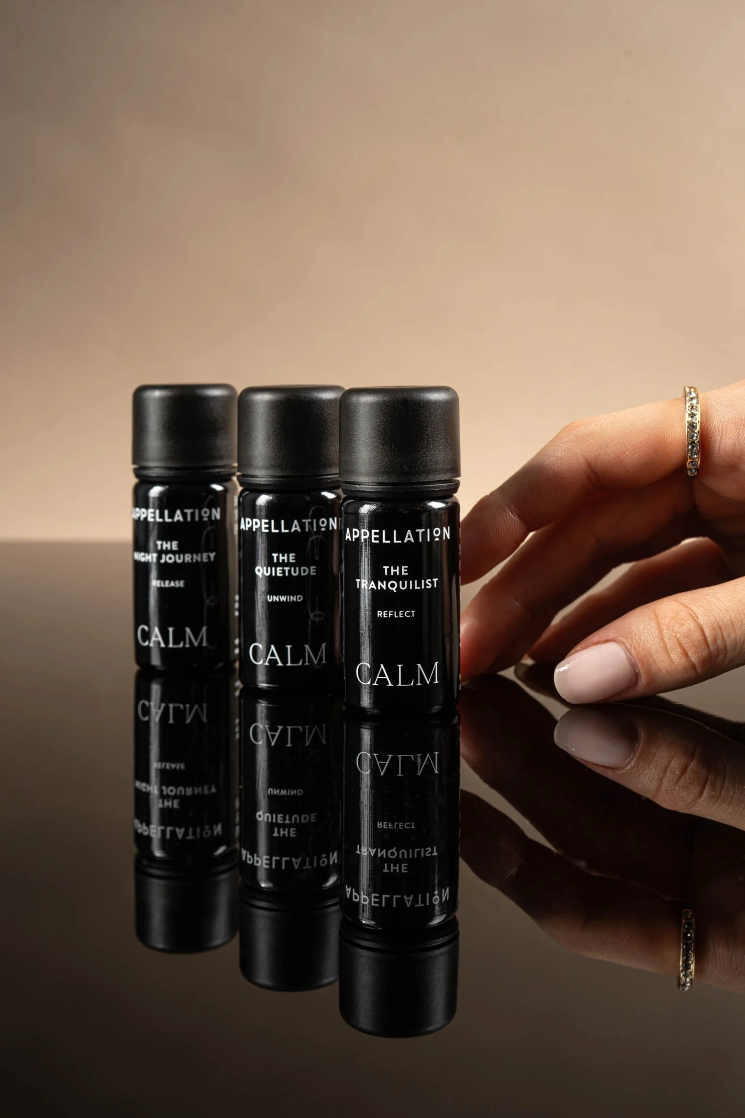
What I notice here is the relationship between the individual product and the wider collection. The repeated placement of the name, the typography and the motifs gives the range a shared rhythm. That is one of the things I want a packaging system to do: help the next product feel as considered as the first.
The earlier design is shown as a documented chapter in the brand’s history. Appellation’s 2025 relaunch also included changes to some blends.
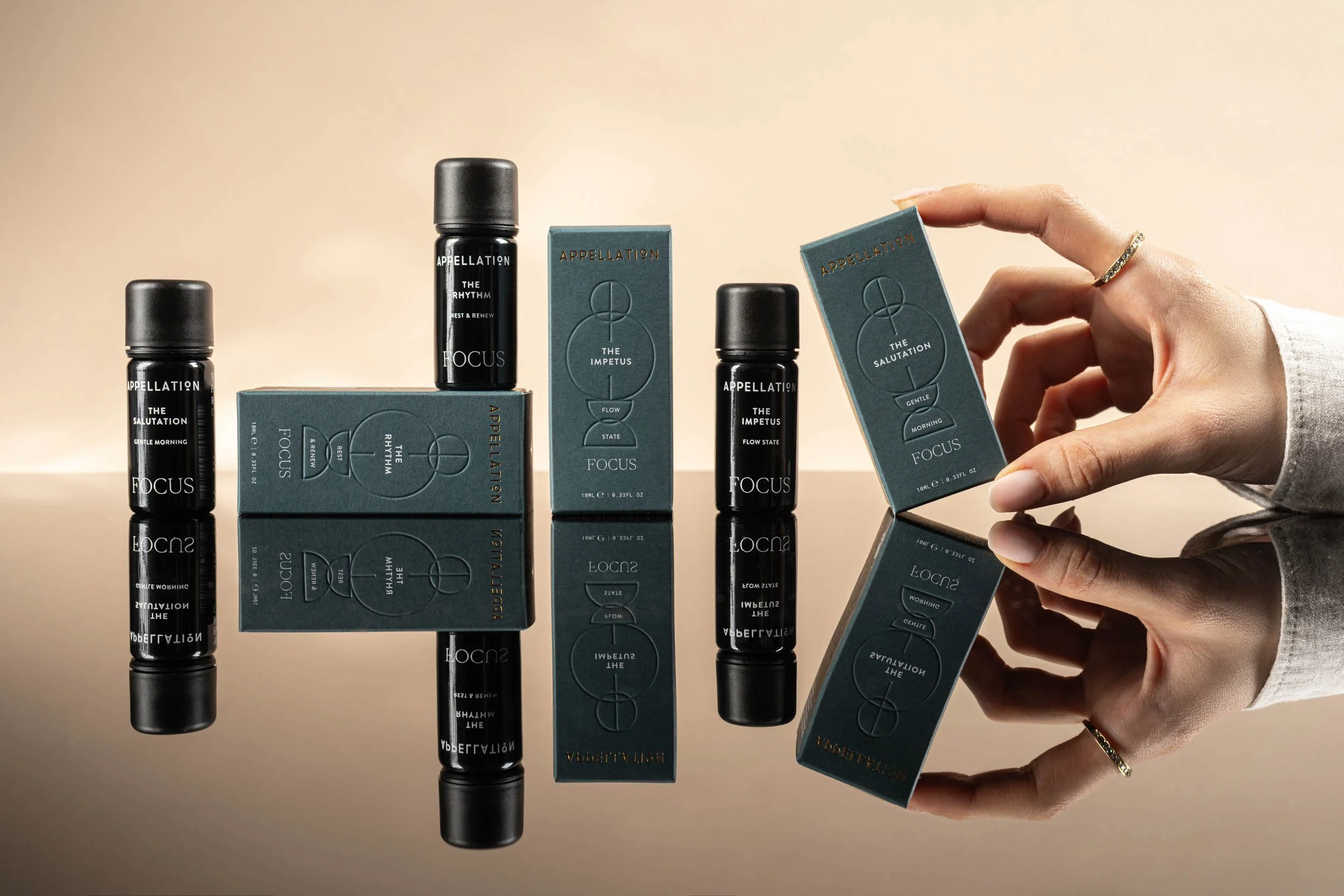
Appellation. A shared visual language, with room for each product line to have its own character. Packaging design by Giada Tamborrino Studio. Photography © Appellation.
It is a useful example of the scale at which I think about packaging. There is the individual bottle, the collection it belongs to, and the impression they create together. All three need attention. When a range grows, the connections between its products become part of the design brief.
I want the values to reach your hands
There is another question I would bring into the conversation: does the physical experience feel right for the brand you are today?
A beautifully photographed box may feel unexpectedly flimsy when you pick it up. A delicate label might be difficult to read. A material chosen at launch may deserve another look now that your production needs have changed. These details affect how someone encounters the care you have put into the product.
With Elelù Beauty, the connection between values and physical choices is visible throughout the project. Colours draw from the Apulian landscape. Uncoated paper and embossing give the packaging a tactile quality. Braille is included on the primary packaging, and a reversible shipping box, developed with Controversa, gives the outer pack another use.
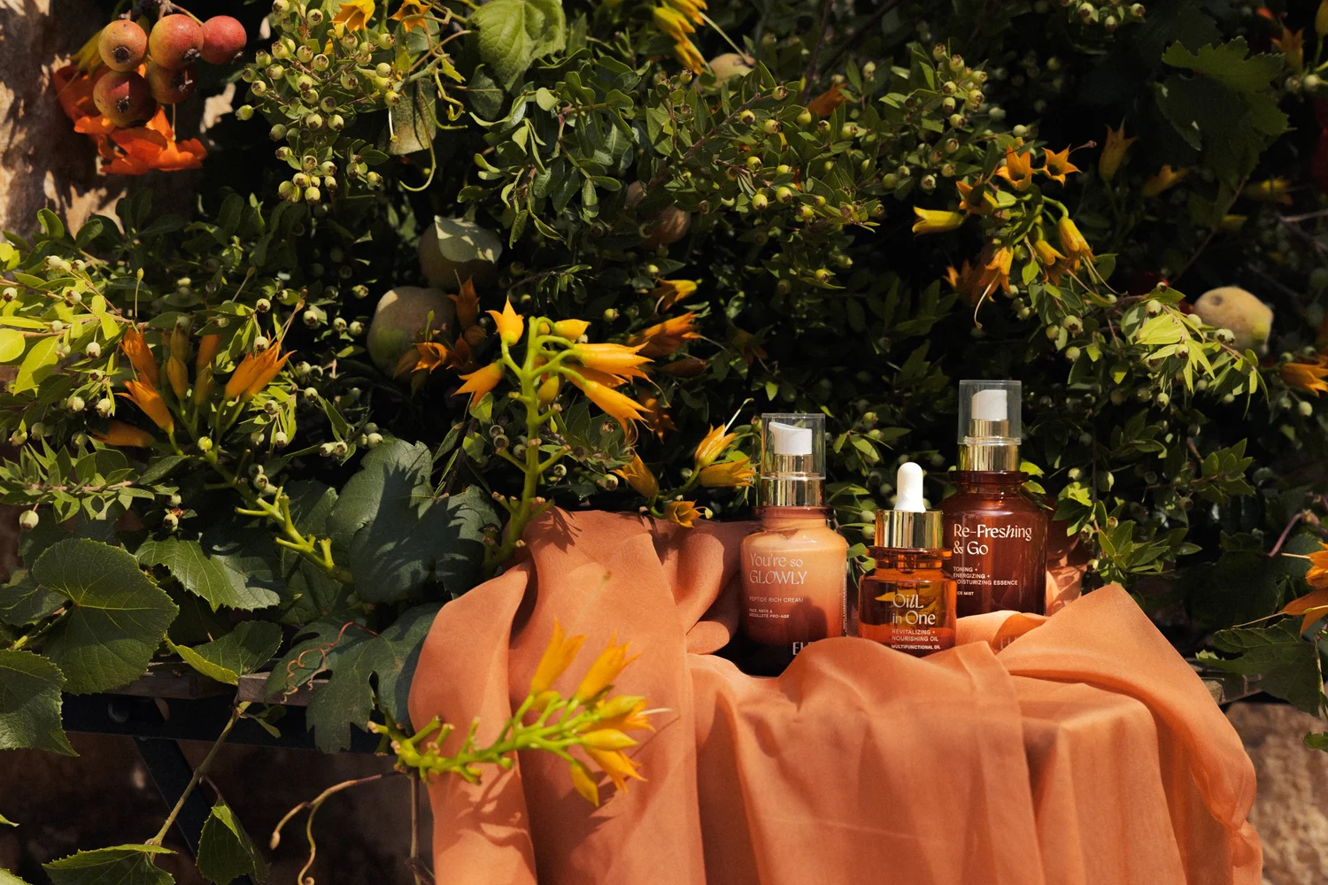
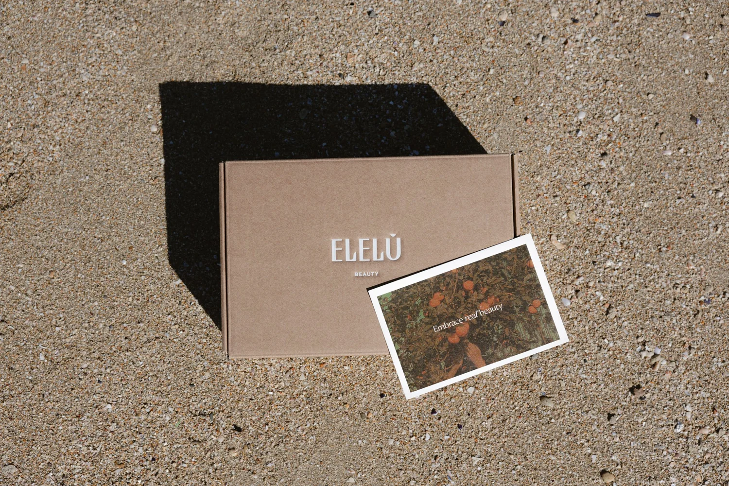
Each decision answers a different part of the brand’s story. Together, they let that story take shape in someone’s hands. That is what I would look for when reviewing an existing identity: where do the things you believe in become something your customer can actually experience?
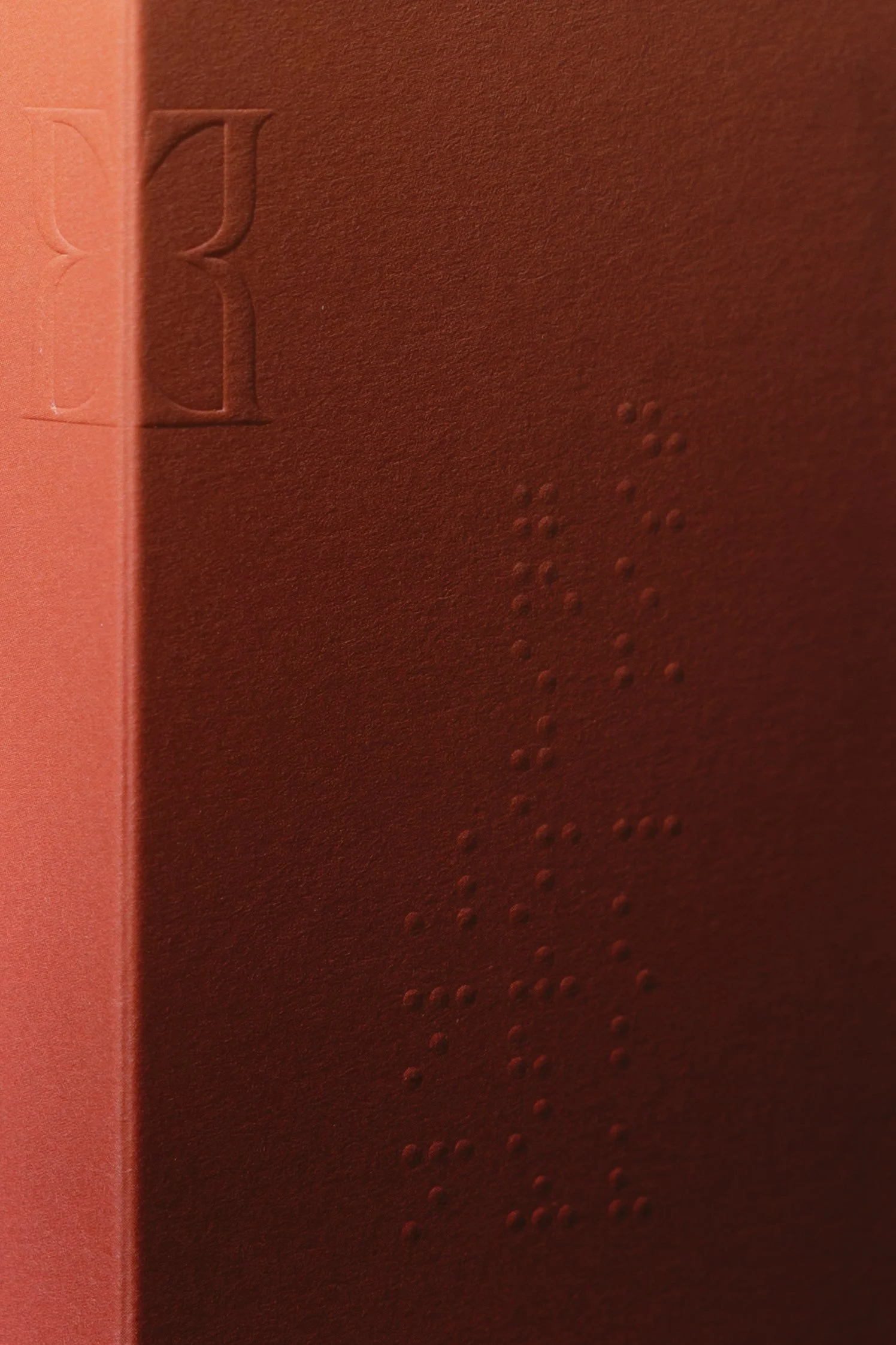
Elelù Beauty. Colour, paper texture and raised details make the identity tangible. Branding and packaging by Giada Tamborrino Studio. Photography © Elelù Beauty.
Finding the right scale of change
Once those questions become clearer, it is easier to decide what the project needs.
A packaging refresh may be enough when the identity still feels relevant and recognisable, but the hierarchy, materials or production details need attention.
A more developed packaging system may be the answer when the collection has grown and needs clearer relationships between products, formats and future additions.
A broader rebrand deserves consideration when the audience, positioning or story has shifted enough that the existing identity no longer expresses the business clearly.
These are starting points for a conversation. I would also look at existing stock, production commitments and the timing of your next launch. A thoughtful transition needs to make sense for the business as well as the design.
A small exercise before you change anything
Place your products together, then look at them alongside your website and a recent photograph or social post. Try seeing them through the eyes of someone discovering your brand for the first time.
Write down what you hope that person will understand. Then look for the details that communicate it. Where does the story feel clear? Where are you relying on an explanation that the packaging cannot give on its own?
Finally, choose three things you would be sorry to lose. They may hold the thread that connects the next chapter to everything you have already built.
That is where I would begin: with a clearer understanding of what your brand has become, and a little curiosity about what it could feel like next.
If you are wondering where your own brand needs attention, my Brand & Packaging Audit offers a place to explore it together. Bring your existing identity and packaging, and we can identify the refinements that deserve your attention first.
For a little more context before you take that step, explore how to make your brand look and feel consistent and the packaging mistakes that can weaken a luxury brand.