
I am easily drawn to a beautiful packaging detail. A fine line pressed into paper. A generous fold. The moment a box opens and reveals something you were not expecting.
Then I start asking questions. What is that detail doing here? Does it help someone understand the product, keep it safe, recognise the brand or enjoy using it? Could the same idea live on a surface we already have?
This is how I like to approach the question of how much packaging a product needs. I want to understand each part well enough to decide whether to keep it, combine its job with something else, or explore removing it. The answer takes us into structure, information, materials and the way your customer actually uses what you make.
First, I want to understand the job
Imagine laying one complete customer order on a table: the container, product carton, insert, sleeve, tissue, sticker, card and shipping box. I would want to know why each piece is there.
A useful answer might be: this insert stops a glass bottle moving. This panel explains how to use the product. This seal shows where to open the pack. This space makes the product name easy to find. Even before we discuss materials, we have something specific to work with.
The Ellen MacArthur Foundation’s guidance on eliminating packaging makes a useful distinction: some packaging has no essential function, while other packaging performs a job that would need to be delivered differently. That distinction matters to me. I would want evidence that a new structure protects the product before removing the part currently doing that work.
For food, this deserves particular care. UNEP’s review of food packaging alternatives considers packaging impacts together with food waste. The balance depends on the product and its circumstances. A smaller pack is a design proposal to investigate, rather than proof of a better environmental outcome.
LIV Botanics: can the box carry the story?
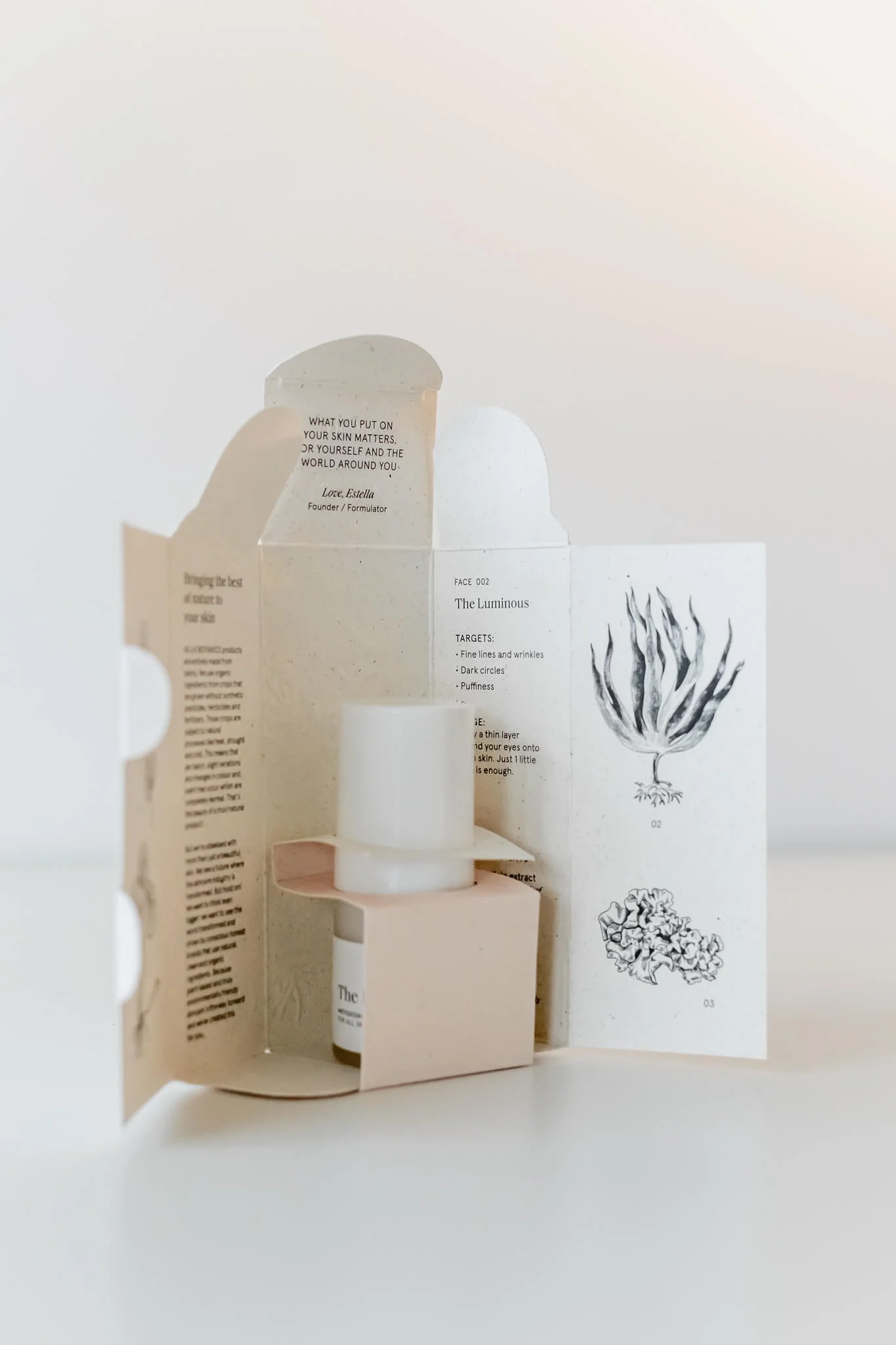
With LIV Botanics, the carton opens out to reveal botanical illustrations and information about the ingredients. The structure uses no glue, and the paper contains elephant grass fibres. The illustrations connect back to the old botanical books that informed the identity.
I love the relationship between those decisions. The surface holding the product becomes a place to spend time with the brand. As you open it, you discover the drawings and the text, and you can see how the folded parts fit together.
That leads me to a question I would bring to another project: could information planned for a separate card sit on the inside of the box? I would try the layout at actual size. The type needs room, the sequence needs to make sense, and information someone needs immediately must be easy to find. Combining jobs only helps when both jobs still work.

MISEICO: what is the finish contributing?
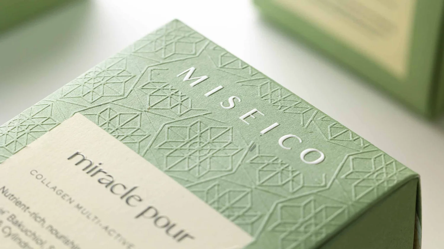
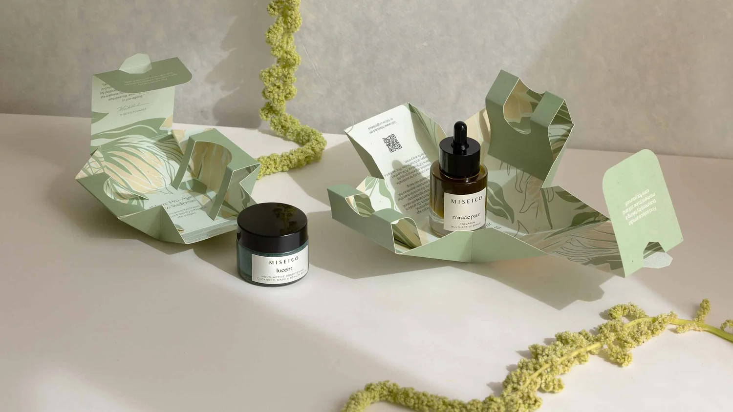
For MISEICO’s packaging redesign, we removed foil from the boxes and chose 100% post-consumer paper. The containers use paper labels without a plastic layer. In the photographs, you can see the quiet green, the pale label and the fine relief of the pattern.
My eye keeps returning to the space around the name and the way the pattern catches the light. Those details give me plenty to work with. When I look at a finish, I want to know what it adds to this particular identity. Is it helping a mark become legible? Giving the hand something to discover? Creating a point of focus?
For your project, I would ask the printer for samples of the actual paper and finish together. I would compare how they look, feel and behave, then look at the production requirements and cost. A finish should have a clear reason to stay. Removing foil from one project is a specific design decision; it does not tell us how every foil application will behave in recycling.
Elelù: what would make someone keep this?
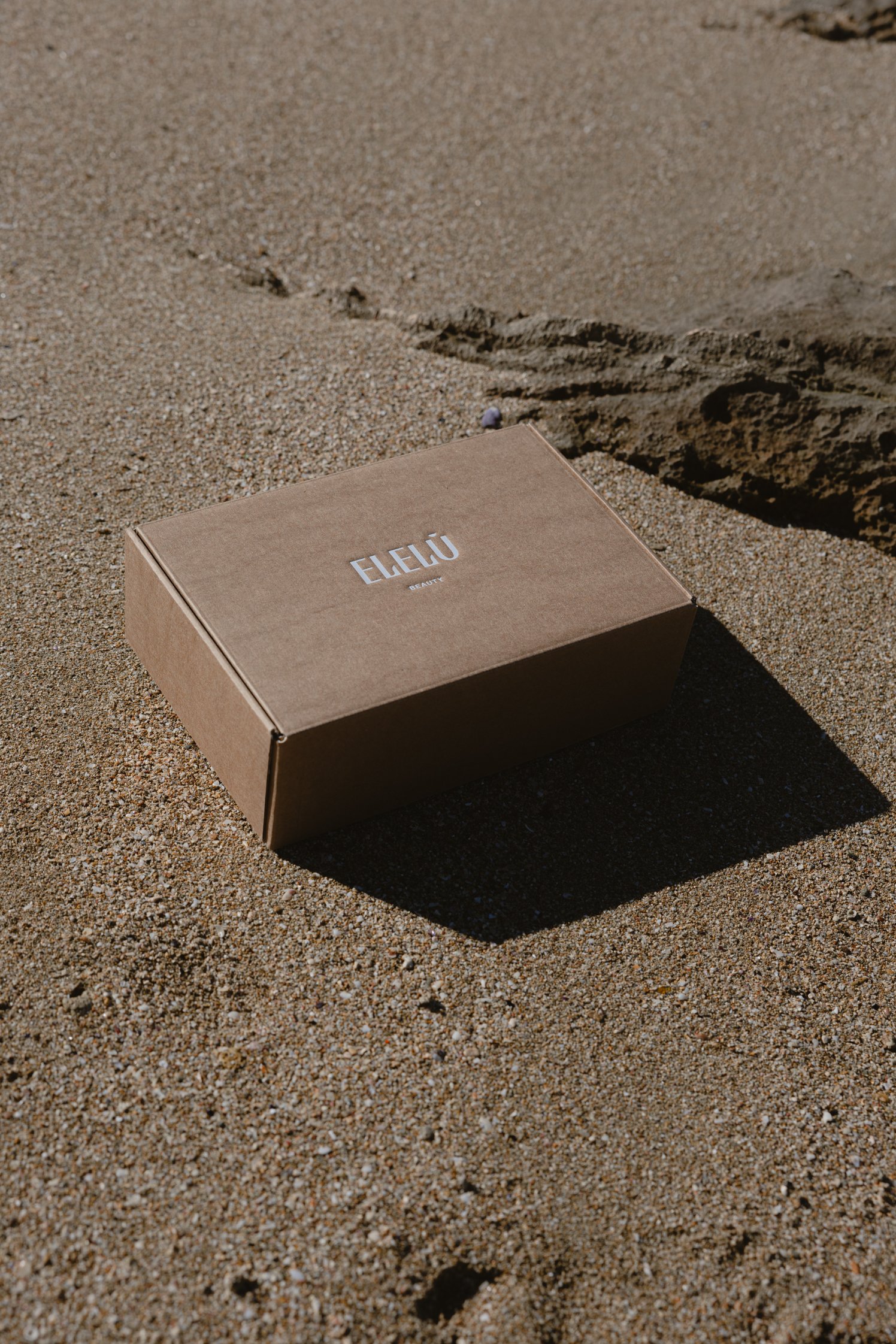
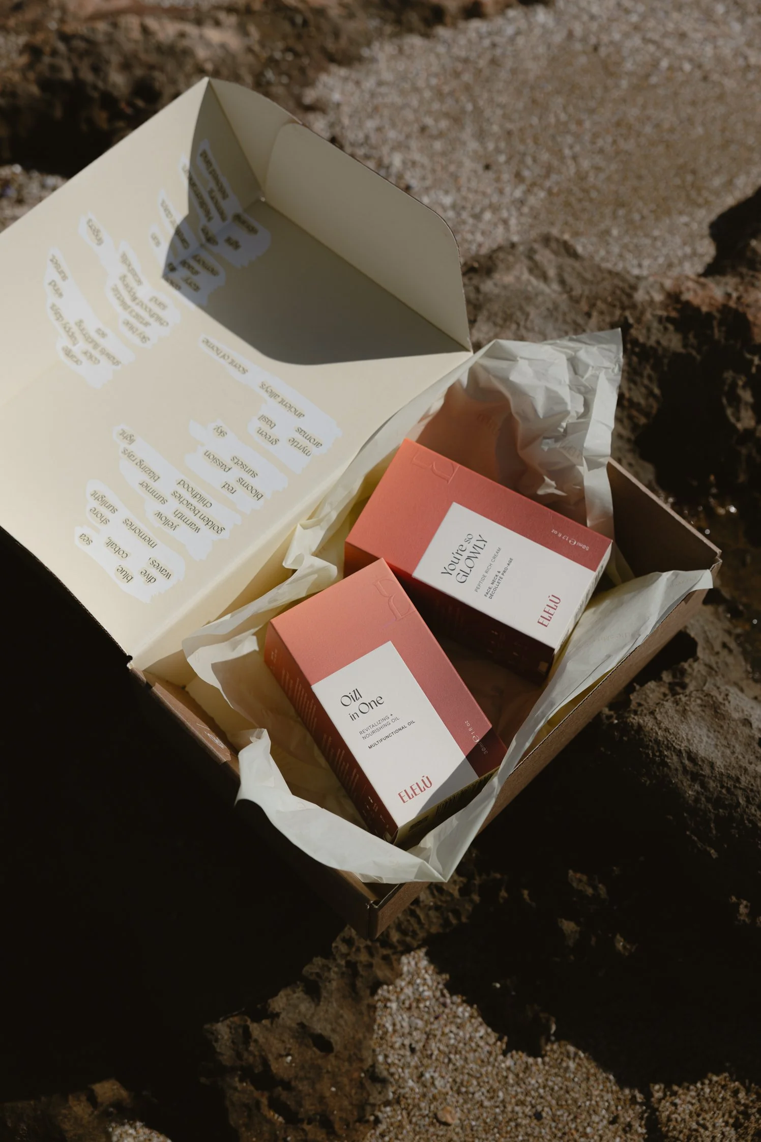
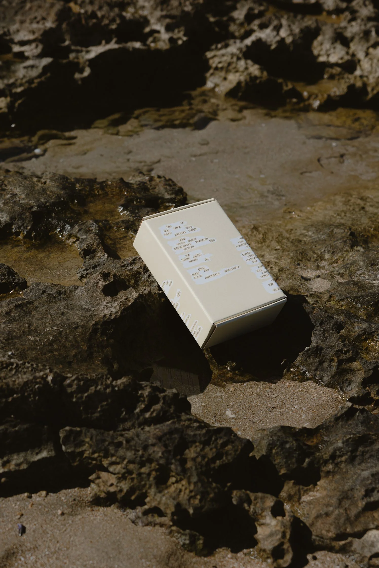
The shipping box for Elelù Beauty, developed with Controversa, can be reversed and rebuilt as a storage container. Found poetry on its inside becomes part of the experience. The photographs show the plain shipping exterior, the open box and the reversed version.
What interests me here is the invitation to do something with a box after the delivery. The next use has been considered in the structure itself.
When exploring an idea like this with you, I would want to make the next step easy to understand. How does someone discover the reversal? Can they take it apart without damaging it? Does the rebuilt box have a useful size and a surface they want to keep around?
Those questions would need prototypes and feedback from people using them. A box designed for a second use creates a possibility. To understand what happens in practice, we would need to know whether people keep it and use it. I would be careful about turning that intention into an environmental claim on its own.
When Nature Calls: what needs to arrive with the second order?
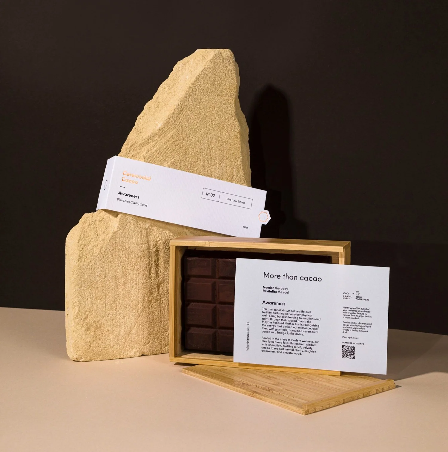
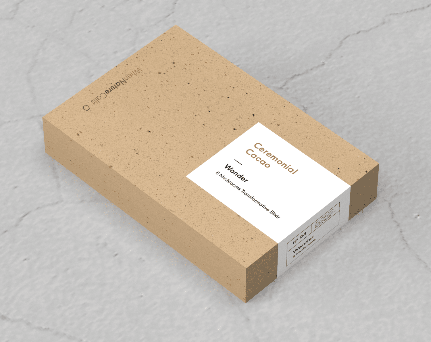
For When Nature Calls’ ceremonial cacao, the design brings together a bamboo box with a sliding lid and a refill concept in paper containing finely ground cocoa bean husks. These are two different moments in the relationship with the product.
The first purchase introduces the object. For a returning customer who keeps the bamboo box, the next purchase can be considered around replenishing its contents. I find that a useful shift in the brief: what does someone already own, and what do they need now?
I would ask how the refill is identified in the shop, whether it fits the original container comfortably, and which instructions need to travel with it. The way someone orders the refill belongs in the design conversation too. A beautiful container can only play its intended role if continuing to use it feels straightforward.
A return scheme would raise another set of questions, including collection and cleaning. The Ellen MacArthur Foundation’s research on returnable packaging examines how infrastructure and return rates affect those systems. It is useful context for thinking beyond the object, rather than a measure of this refill concept’s impact.
I want to understand the whole material specification
Once the structure feels right, I want to look closely at what it is made from. A paper surface does not tell me everything about the finished pack. I would ask about coatings, adhesives, windows, printing and any components attached to it.
The 4evergreen Circularity by Design Guideline offers design recommendations for fibre-based packaging components in relation to different recycling processes. It is an industry guideline, and a useful reminder to discuss the complete construction with the supplier. A material description on its own cannot answer every question about collection, sorting and recycling.
For a brand selling across several countries, I would also want to understand the relevant local collection routes. Clear disposal information should follow the actual pack and the places it will be used. This is where I would bring the converter or packaging supplier into the conversation early, with samples and technical specifications on the table.
The cost question goes beyond the price of the box
If we were comparing two packaging ideas, I would want to see the complete packed order and understand the work behind it. How long does assembly take? How much space is needed to store the flat packaging? Can one format serve several products? What happens when a customer orders two items together?
For example, a separate sleeve might carry changing product information while the same box serves several versions. In another project, printing that information directly on the carton might be simpler. I would compare the actual quantities, printing options and packing steps before choosing.
Reducing the component count can be worth exploring, but I would still check the production quote, assembly process and protection. This is also why I would test a representative packed order, including the shipping packaging, before committing to a new format.
A small exercise before your next packaging brief
Bring one complete order, exactly as your customer receives it, and work through these questions:
Name the job. What does each piece protect, explain, hold or help someone do?
Look for overlap. Are two pieces repeating the same message? Could an existing surface carry it clearly?
Separate the first purchase from the next. Which parts are needed again, and which could have a longer role?
Choose one change to investigate. Make a sample and decide what would need checking: movement in transit, opening, legibility, assembly time or the next use.
I would also love to see the detail you are most attached to. Perhaps it is a particular colour, a tactile paper or a note that customers mention. That tells me what the experience means to you, and gives us something valuable to design around.
If you would like to see how I develop those connections, read where a packaging idea really begins. If you are working out how much of your existing identity needs to change, my article on refreshing your packaging or rebranding explores that starting point.
For me, the satisfying moment is when I can explain why each part belongs, and you can see how the choices work together. If you are ready to look at your own packaging this way, explore my branding and sustainable packaging design services and tell me what you are making.
Sources and further reading
The projects above illustrate design decisions. The resources below provide context for the wider questions of reduction, protection, reuse and recyclability.
Ellen MacArthur Foundation: Upstream Innovation, Elimination (2022), on packaging functions and elimination.
UNEP: Single-use supermarket food packaging and its alternatives (2022), a life cycle assessment review focused on food.
Ellen MacArthur Foundation: Unlocking a reuse revolution (2023), on the conditions needed for returnable systems.
4evergreen: Circularity by Design Guideline (version 4, 2026), industry guidance on fibre-based packaging and recycling processes.