
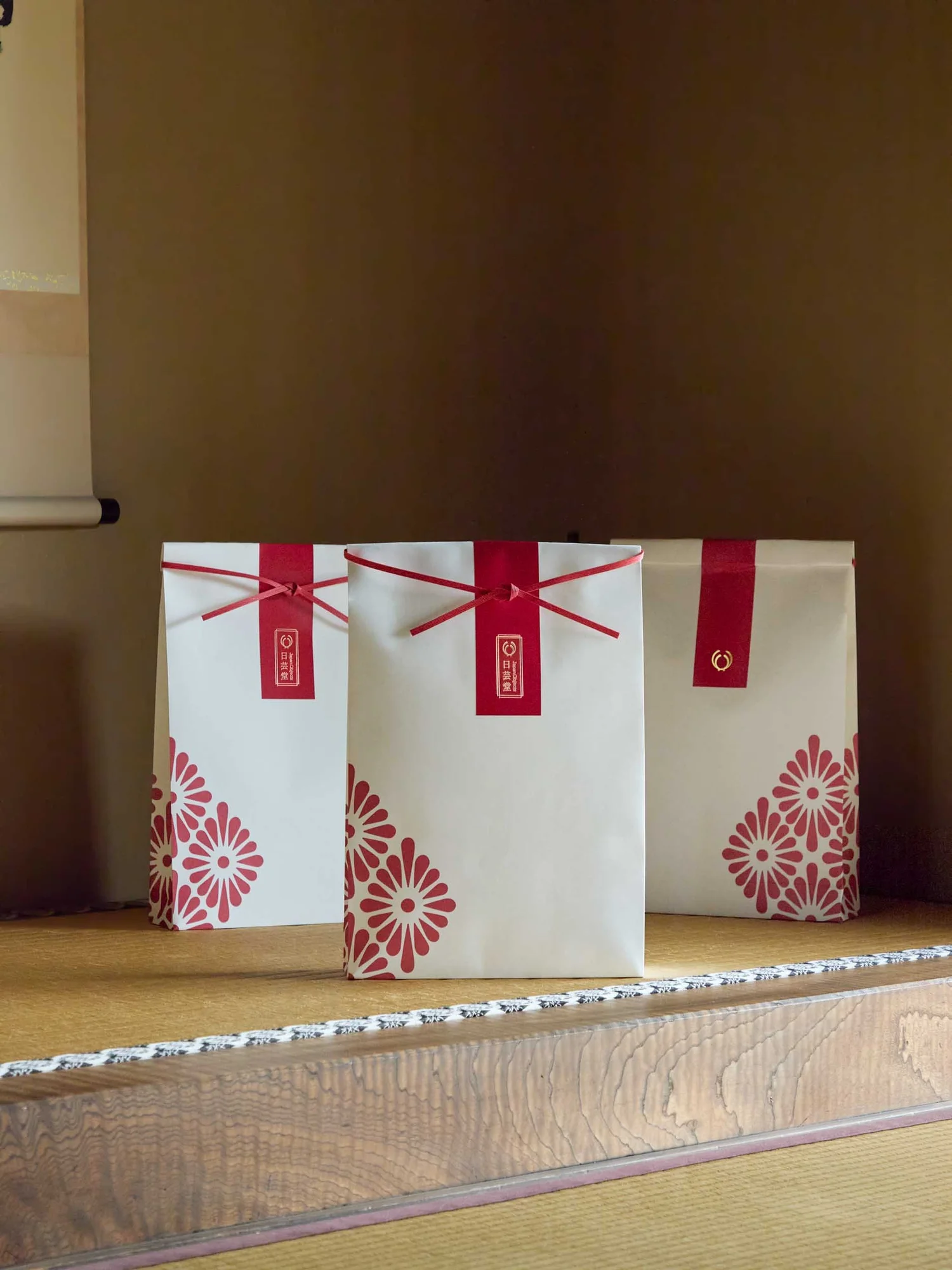
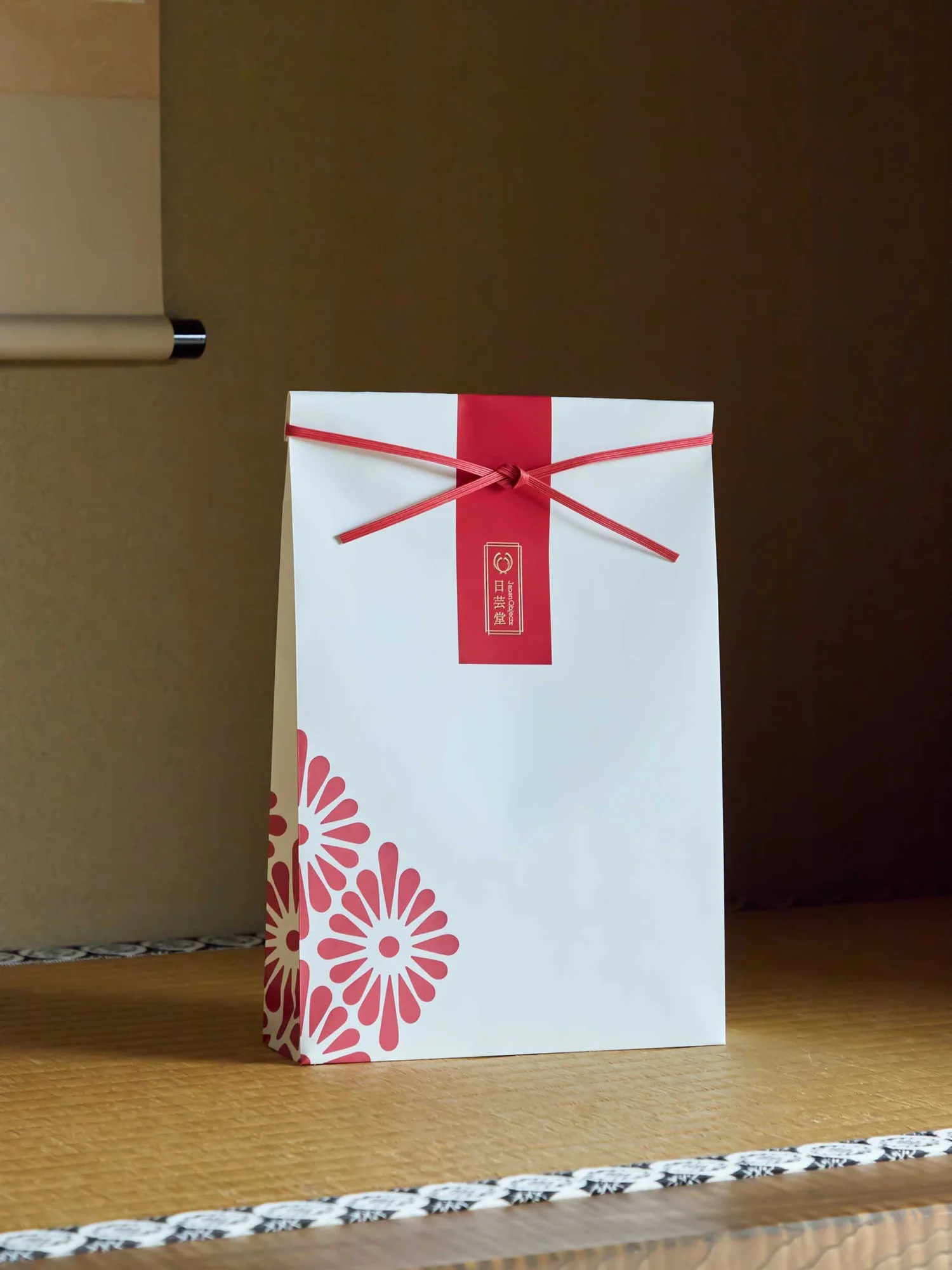
There is a small detail in the packaging I designed for Japan Objects that says a lot about how I think. The pattern on the paper bags was considered at different heights, so it still feels balanced when the top is folded lower around smaller contents.
I like that detail because it asks the idea to work in someone else’s hands. In a photograph, I can choose the composition. In use, the contents change, the fold moves and someone has an order to prepare. I want the design to make sense there, too.
This is the part of packaging design I want to share: how a feeling becomes a pattern, a fold, a material or a small gesture.
I stay with the words for a while
If you tell me you want your packaging to feel considered, natural or premium, I am interested in what those words mean to you. They are a beginning. I want to get close enough to them that we can make a decision.
“Considered” might mean that your customer can understand the product without turning the box around three times. It might mean the care of a gift, or the feeling that every part has a purpose. Those interpretations would lead me towards different designs.
So I would ask about the product, the person choosing it and the moment it arrives in their life. Is it something they buy for themselves? A gift they want to feel proud to give? Part of a familiar daily routine?
I find those answers more useful than a collection of beautiful references on their own. They help me understand what the references are supposed to do. If you are still finding language for your business, my guide to finding your brand’s essence is a good place to begin.
Finding a reference that belongs to the brand
Japan Objects celebrates Japanese culture, art and craftsmanship. Its packaging needed to carry that care across a varied collection, from art prints to kimono jackets.
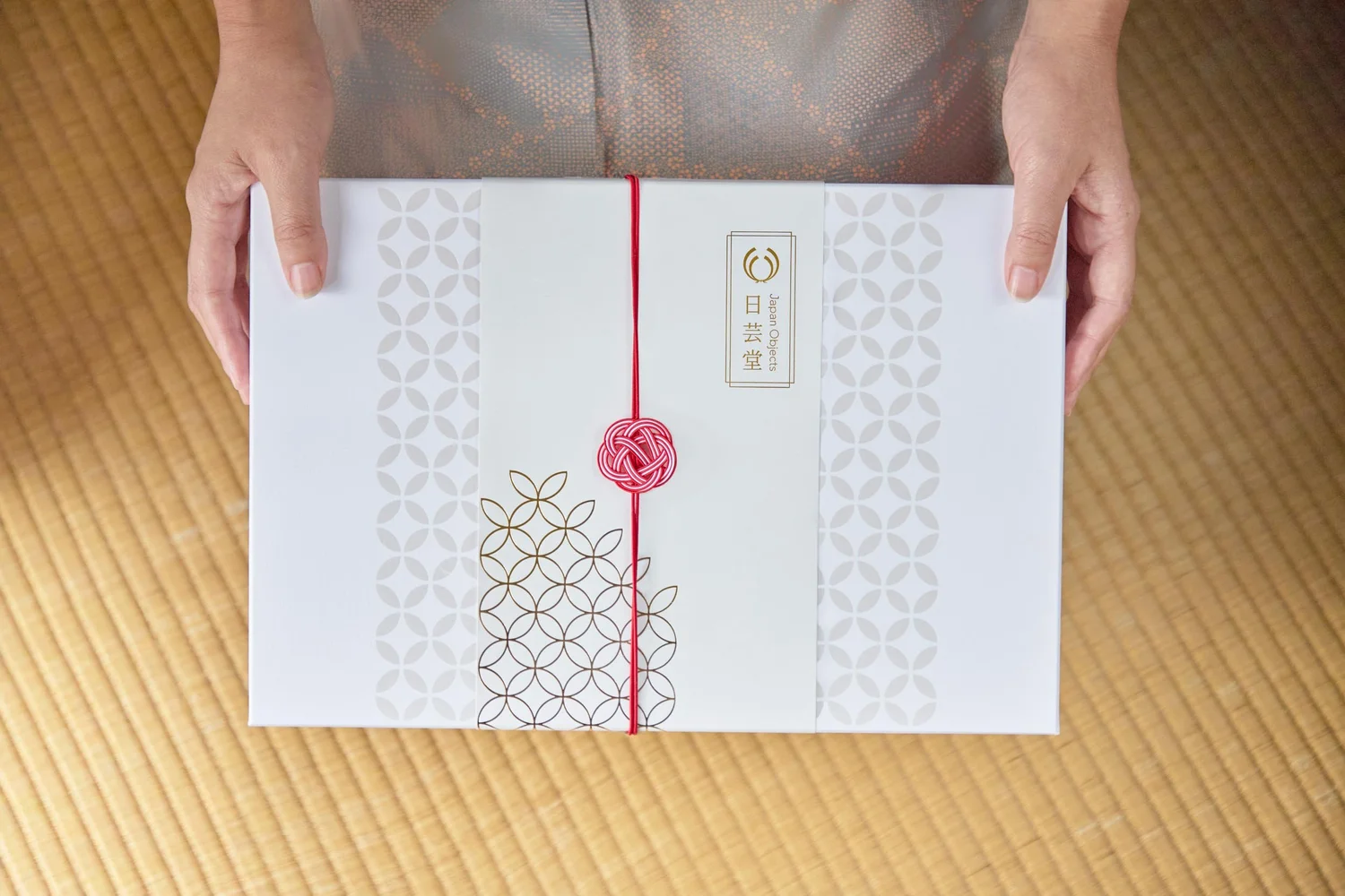
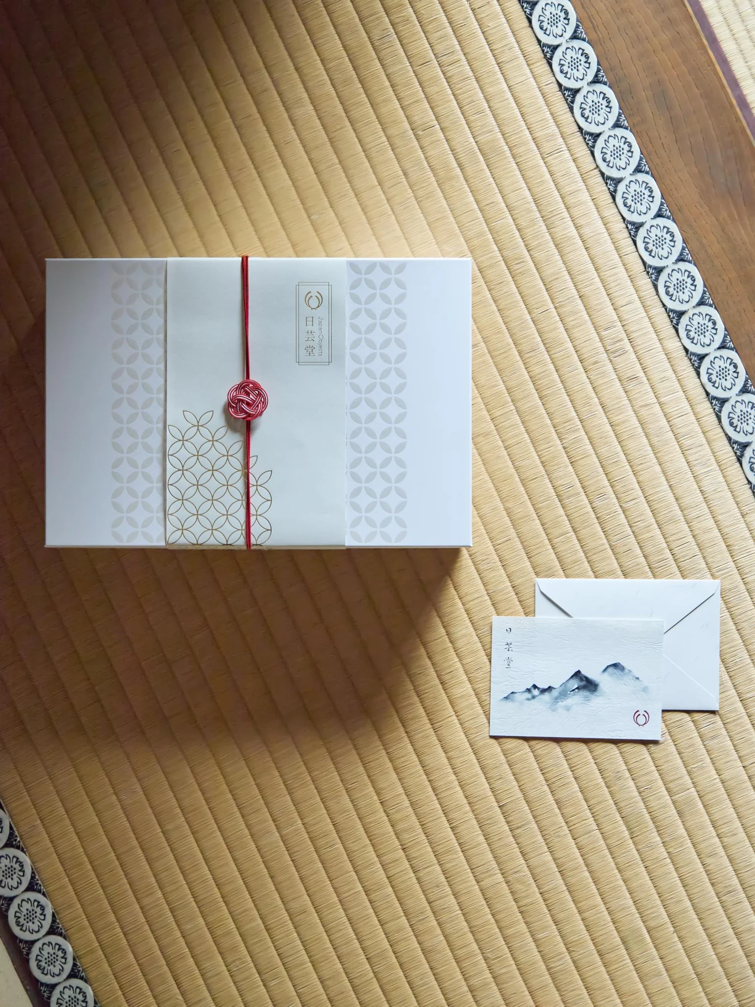
The gift box brings together a pearl-white Shippo motif, a tactile paper obi belt and a red mizuhiki cord and seal. The rice bags use red floral motifs with references to Japanese family crests and seasonal symbolism.
What interests me is how a reference becomes part of the way an object works. The belt wraps. The cord closes. The motif has to find its place on a surface that will be folded. Each choice has a relationship with the others.
I want to be able to explain that relationship to you. Why this scale of pattern? Why this contrast between the paper and the cord? What does the detail contribute to the experience? A clear idea gives us something to return to when we are choosing between several attractive possibilities.
Then I ask what your hands will do
A word like “ritual” becomes more useful to me when I imagine an action. Where do your hands go first? What do you discover as the packaging opens? When do you need a little guidance?
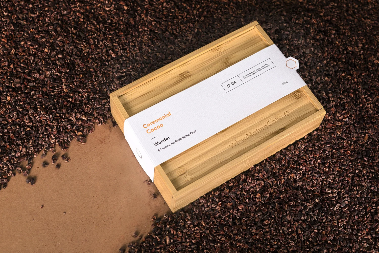
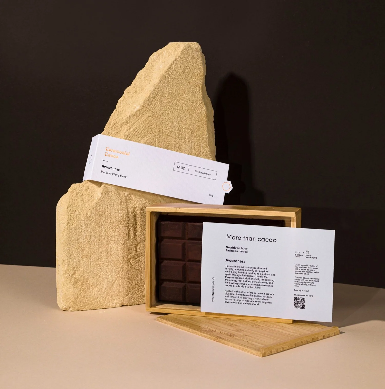
For When Nature Calls’ cacao packaging, that idea takes shape in a bamboo box with a sliding lid and a translucent information card. The card lets part of the cacao show through while giving instructions for preparing it. A refill pack uses paper containing cocoa bean husks.
I see the idea in the movement of the lid, the glimpse through the card and the cocoa fibres in the refill paper. Each brings the story into something the customer can experience.
That is the level at which I like to look at a concept. I want to understand what someone will see, touch and do, and whether those things feel connected.
The practical questions belong in the idea
I keep coming back to those Japan Objects bags. A different fold changes the amount of surface you see. It changes where the pattern ends and how it sits beside the seal. Thinking about that early gives the design room to work across different contents.
For your brand, I would want to know who will pack the product, which sizes need to fit, how it will travel and what happens when the next item joins the collection. These questions can shape the format as much as the visual references do.
I also want the material choices to have a clear purpose. A textured paper, an extra layer or a special finish each adds something to the object. We should be able to say what that addition contributes, and consider the production requirements alongside it.
This is where I enjoy the work most: moving between the overall feeling and the small decisions that make it possible.
What I would love you to bring to a packaging brief
You do not need to arrive with a design solution. A few specific observations can give us a much more useful starting point.
One moment you want to create. Describe what someone is doing when they meet your product, and how you hope they feel.
One detail that already feels like you. It could be a colour, a familiar gesture, the way you explain your work or a material you love for a particular reason.
One practical difficulty. Perhaps an awkward format, too many different boxes or a part of the opening experience that needs care.
I would look for the connections between those three things. That is often where an idea starts to become specific enough to draw, make and discuss together.
If you are preparing a project, you can explore what to expect when working with a branding designer. And if you are reviewing packaging you already have, my article on choosing between a packaging refresh and a rebrand looks at where change might belong.
When you are ready to turn those observations into a project, take a look at my branding and packaging design services. I would love to hear the story behind what you are making.