
Appellation
online design awards q1 2026 winner:
STUDIO/AGENCY gold  - Packaging Design
STUDIO/AGENCY winner - Brand Identity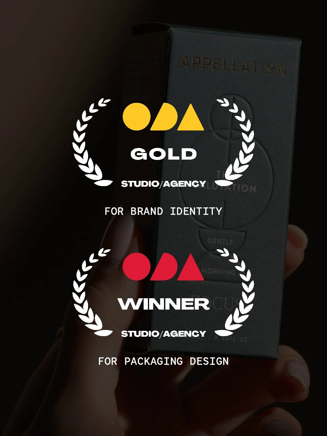
A refined blend of design, wellbeing, and intention.
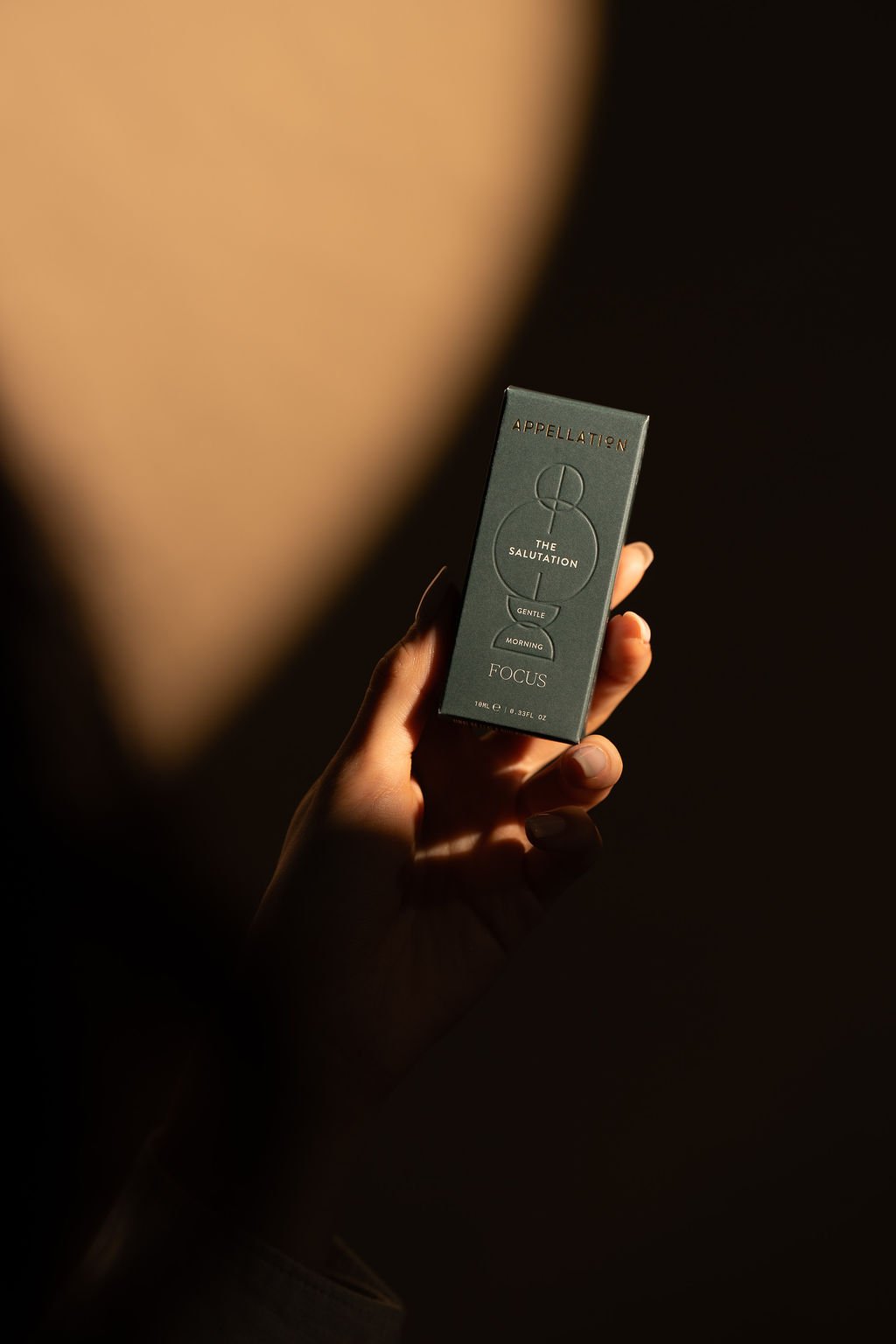
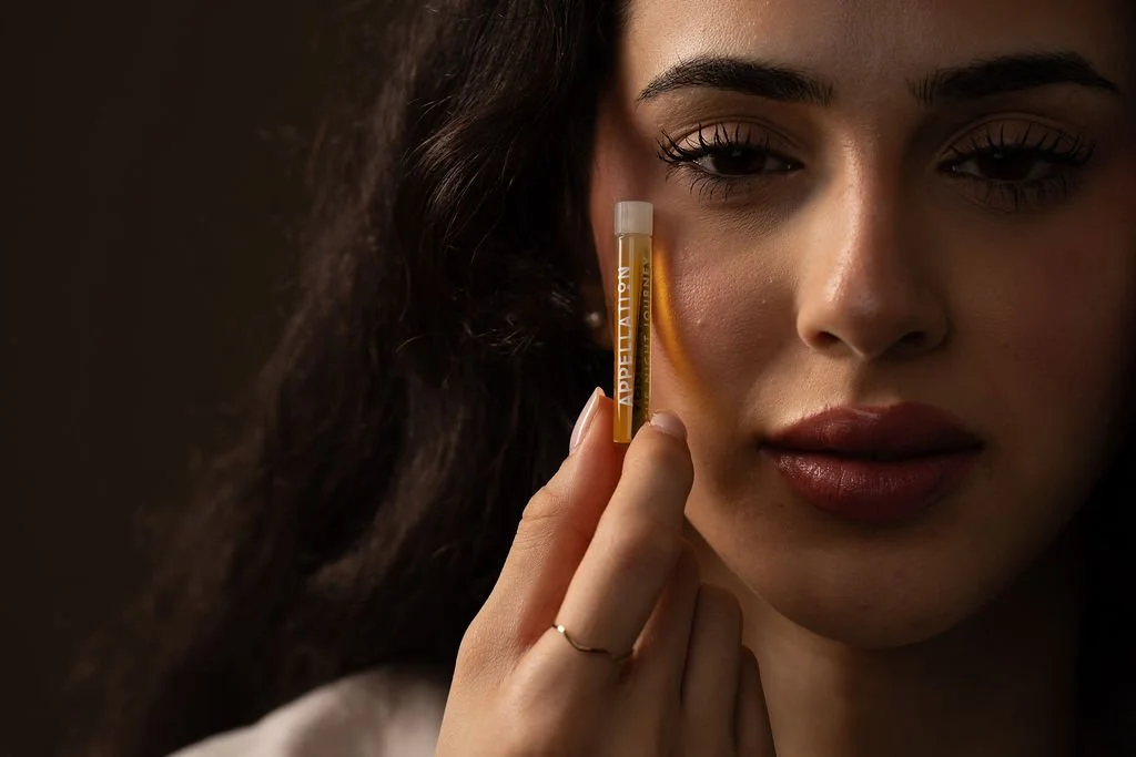
Appellation is a modern aromatherapy brand rooted in the art of scent, designed to bring balance, clarity, and calm to everyday life. Inspired by ancient traditions and contemporary science, Appellation offers 100% natural essential oils sourced with care and purpose.
Guided by a philosophy of sensory wellbeing, the brand invites a slower, more intentional approach to self-care—one that elevates simple moments into grounding rituals.
In close collaboration with founders Michelle and Michal, we developed the new packaging system and visual elements for Appellation’s relaunch, crafting a cohesive design language that reflects the brand’s elegance, functionality, and emotional resonance.
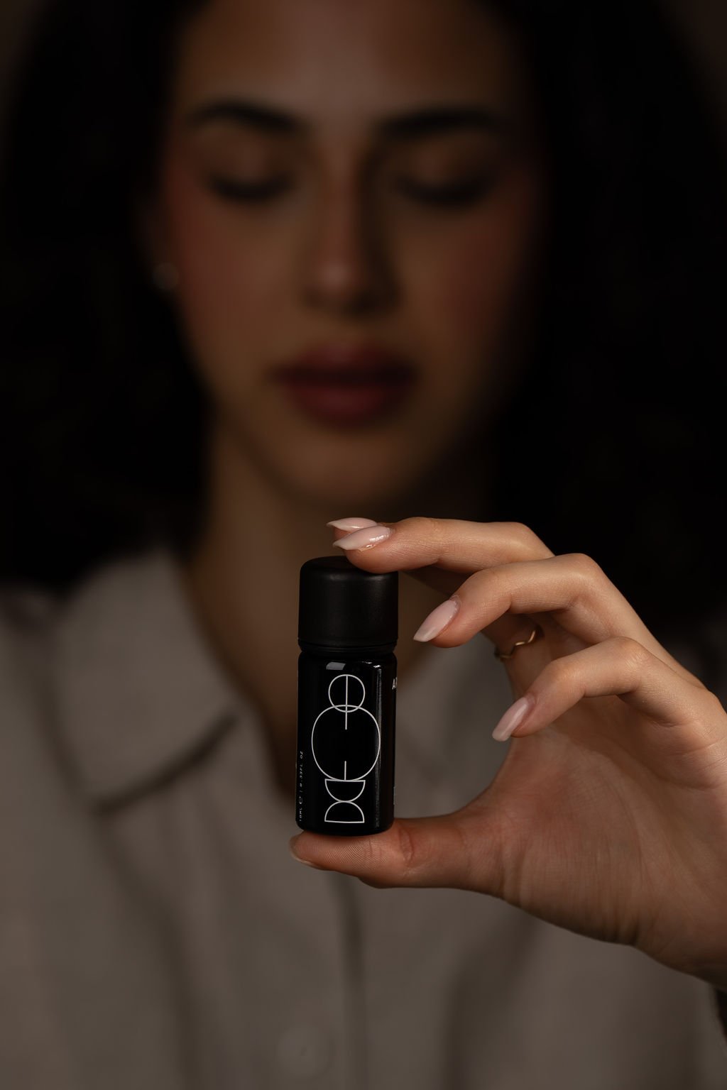
Where scent becomes ritual
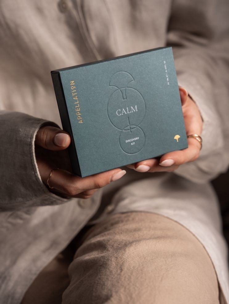
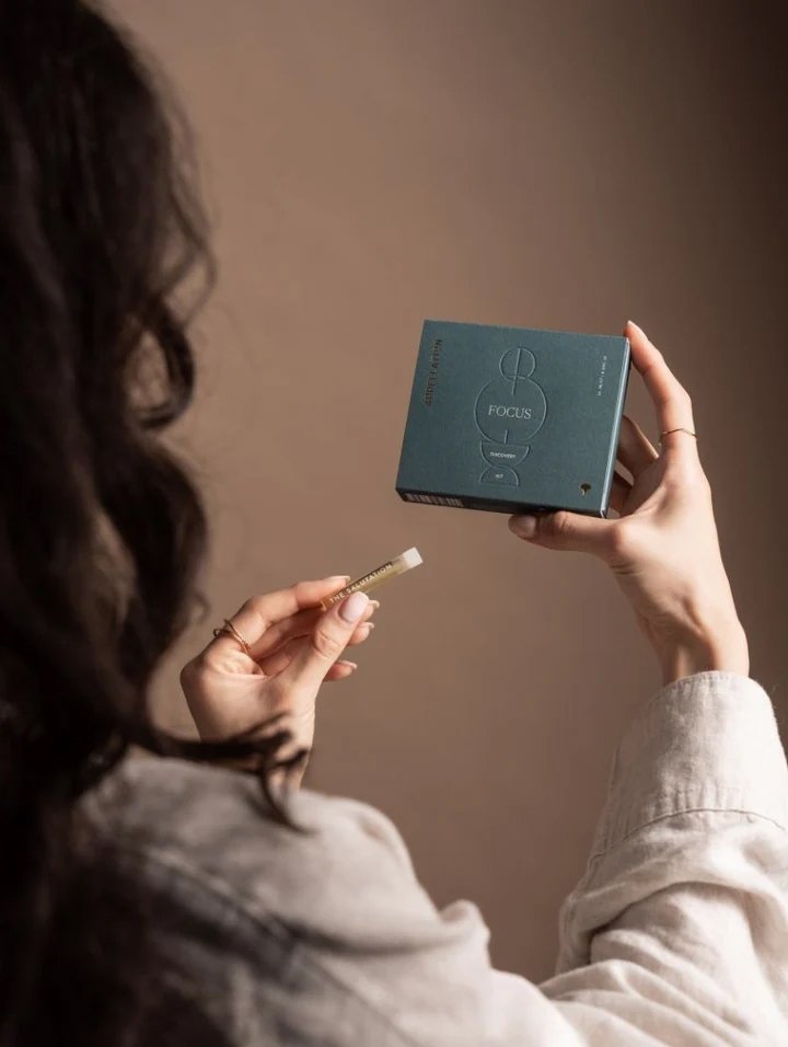
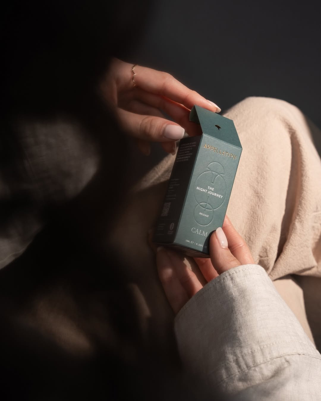
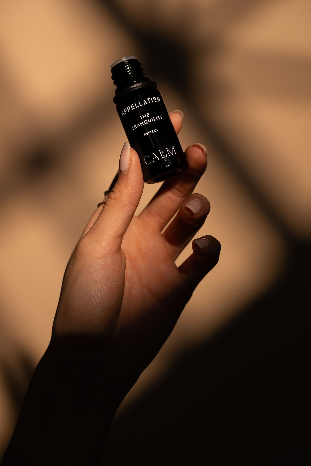
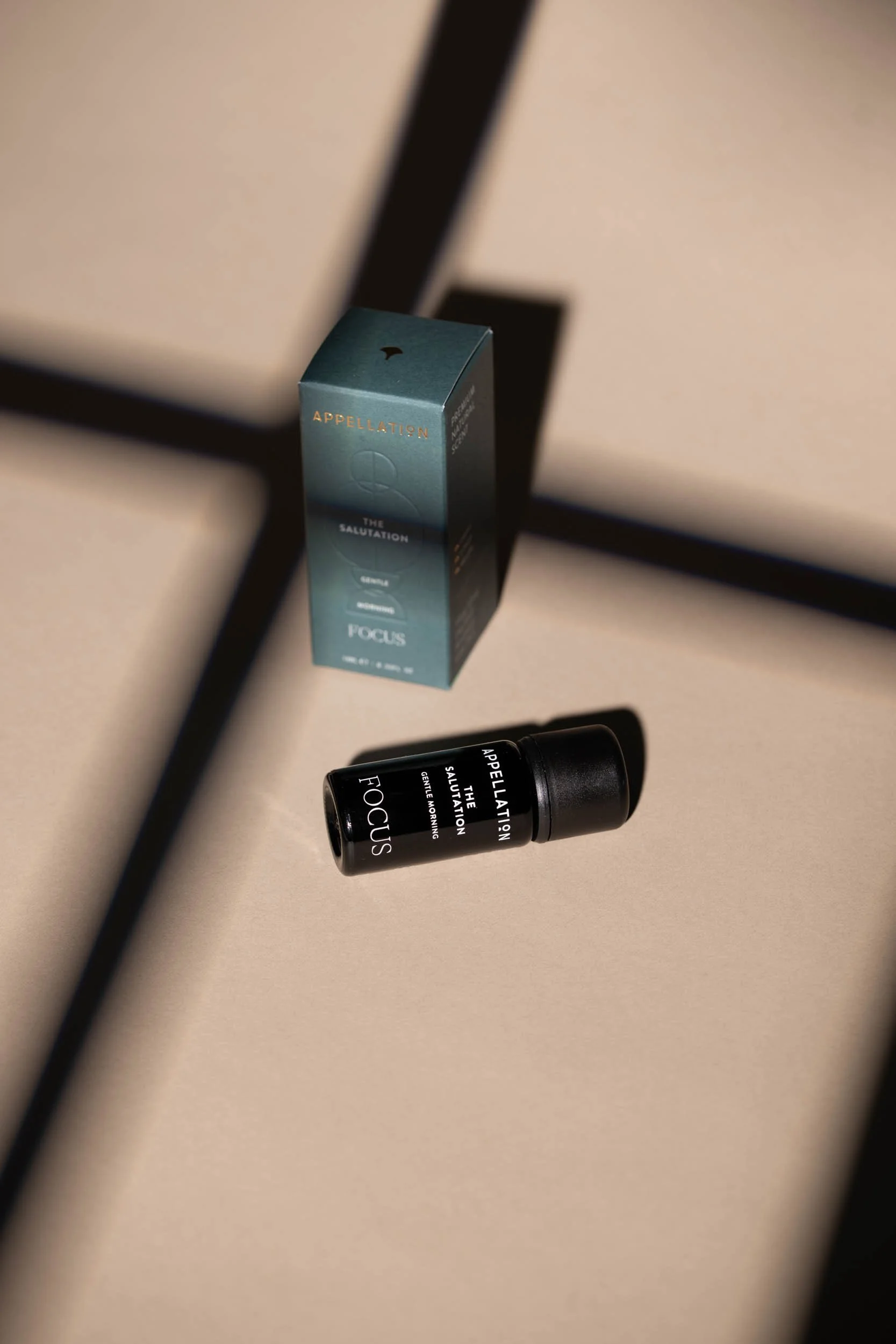
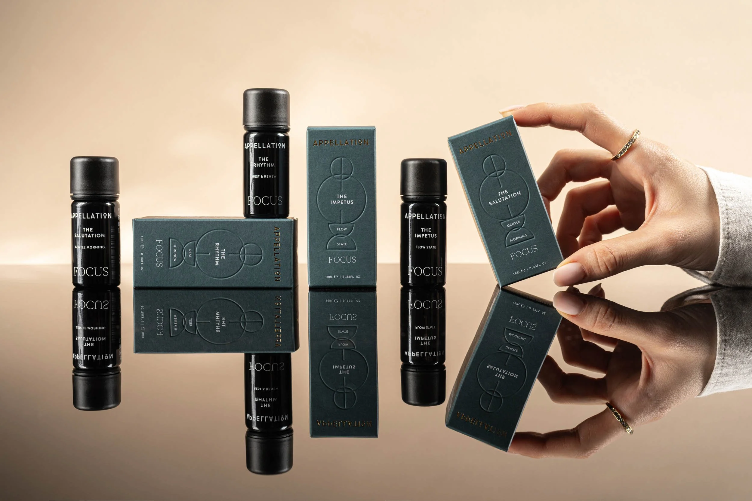
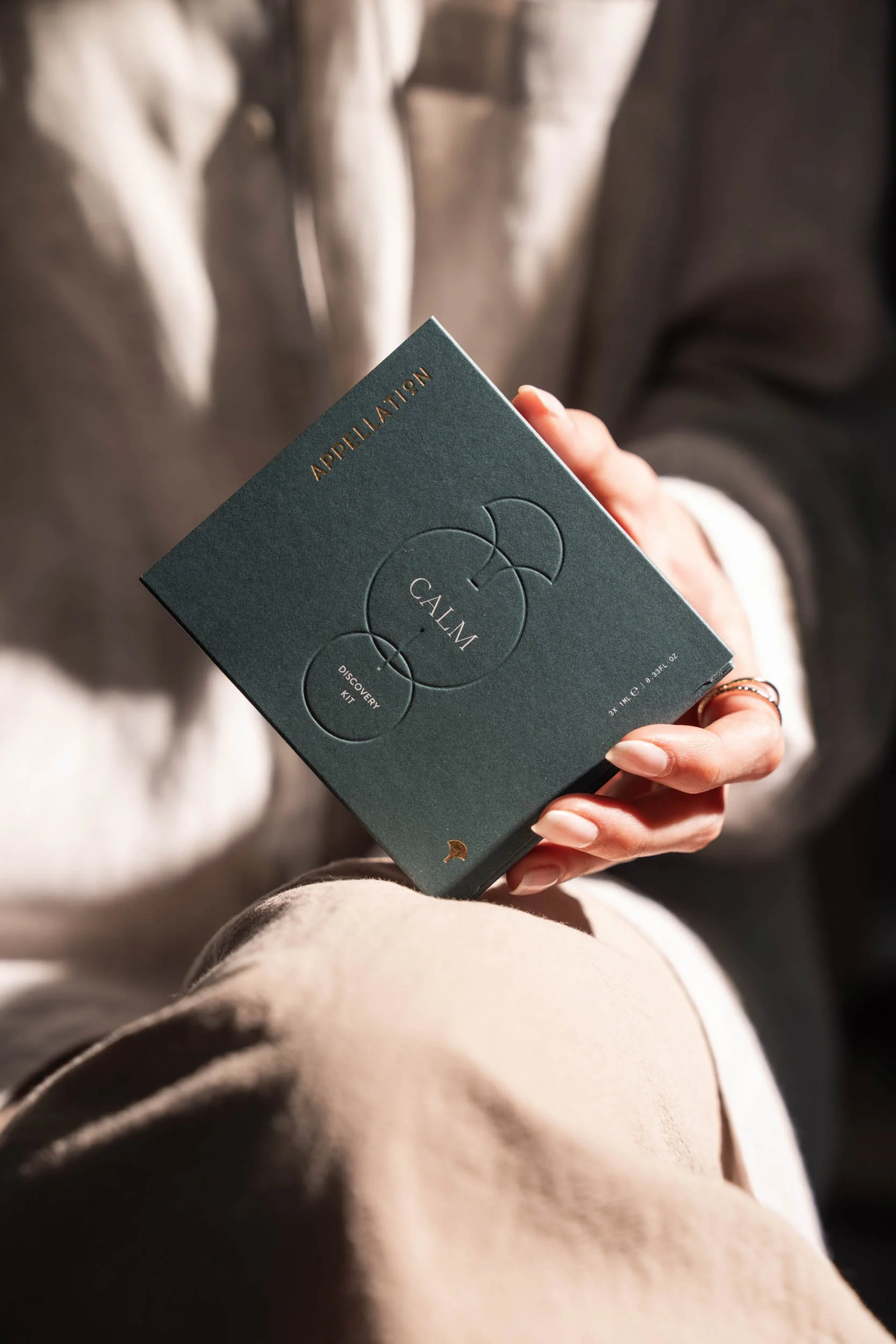
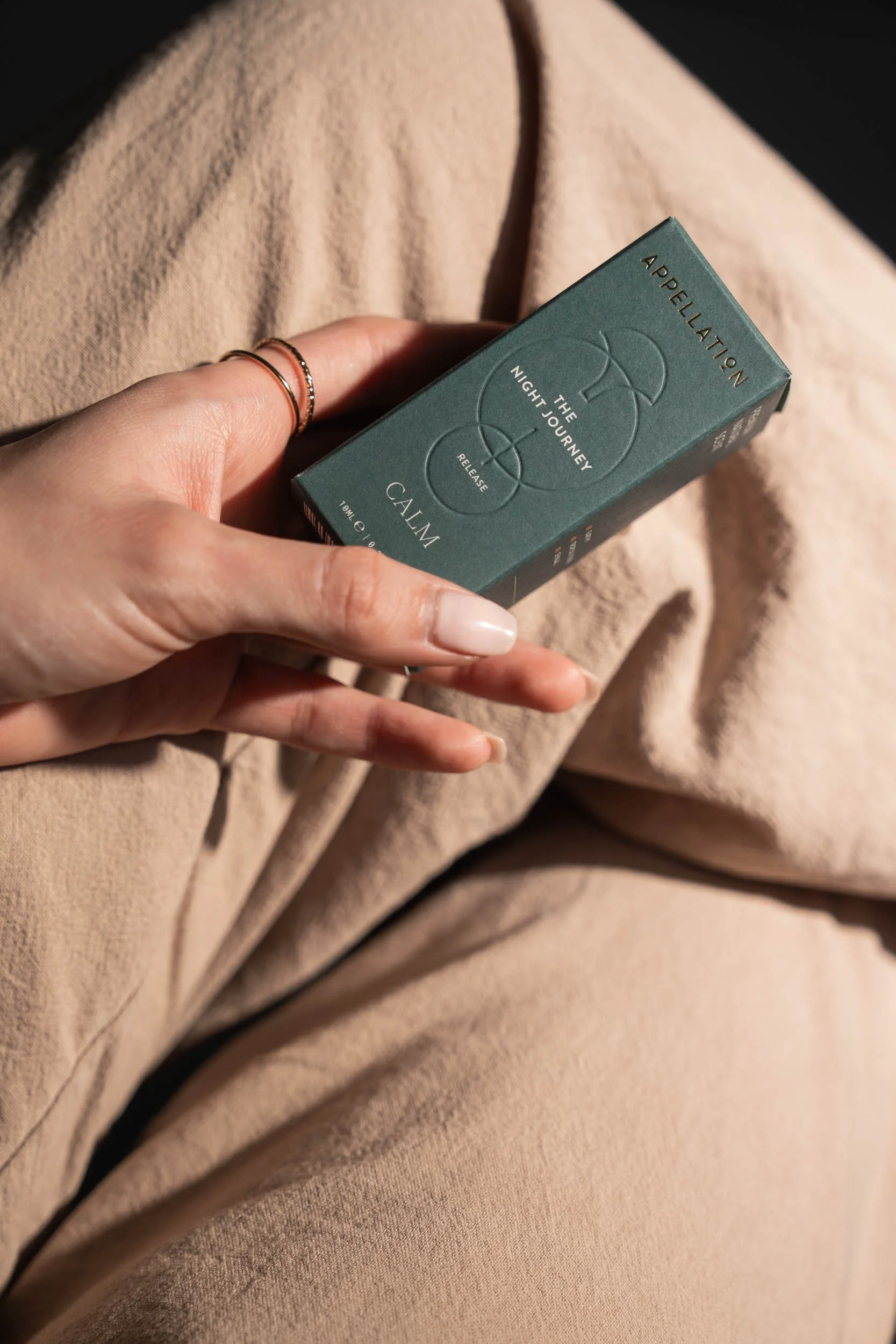
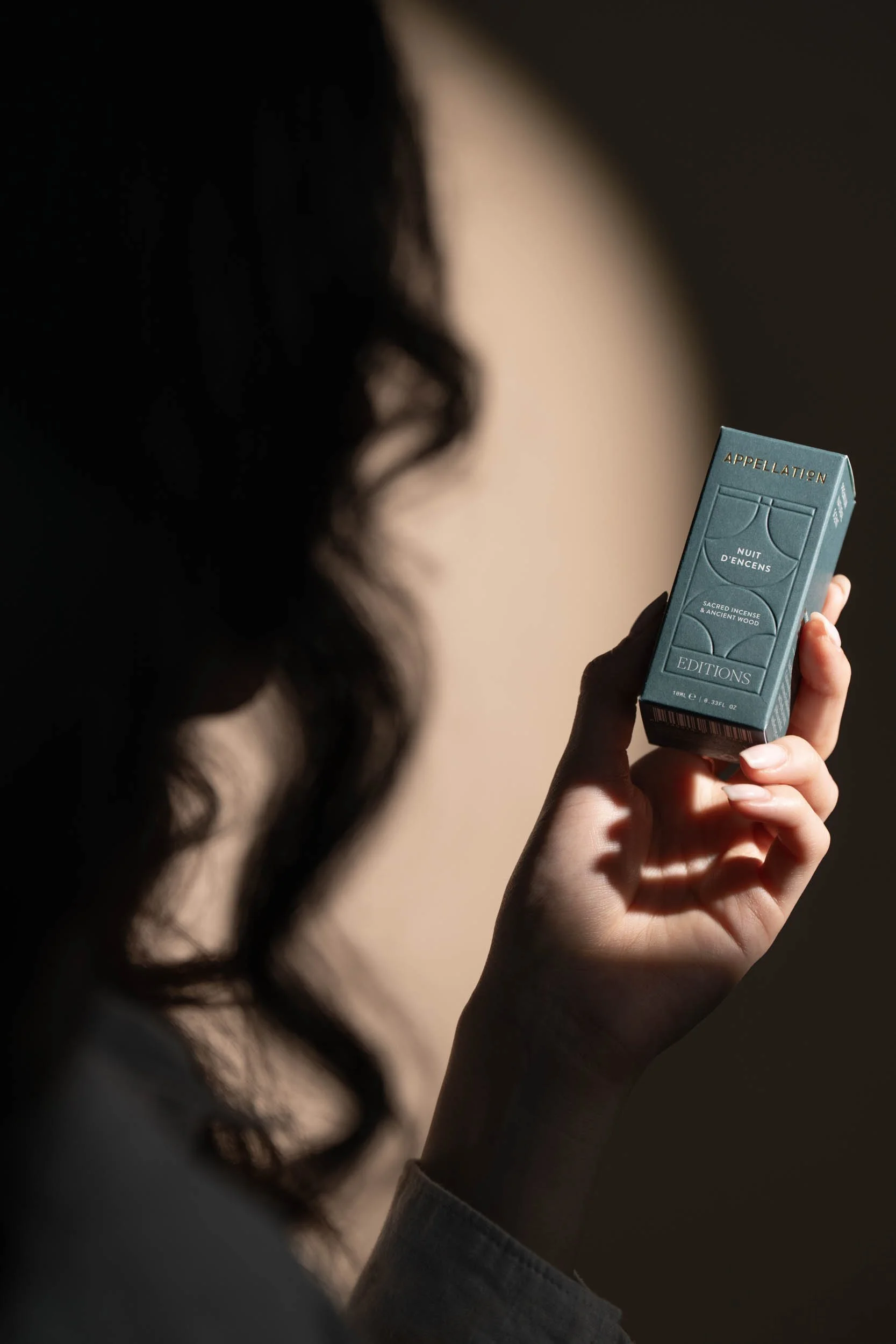
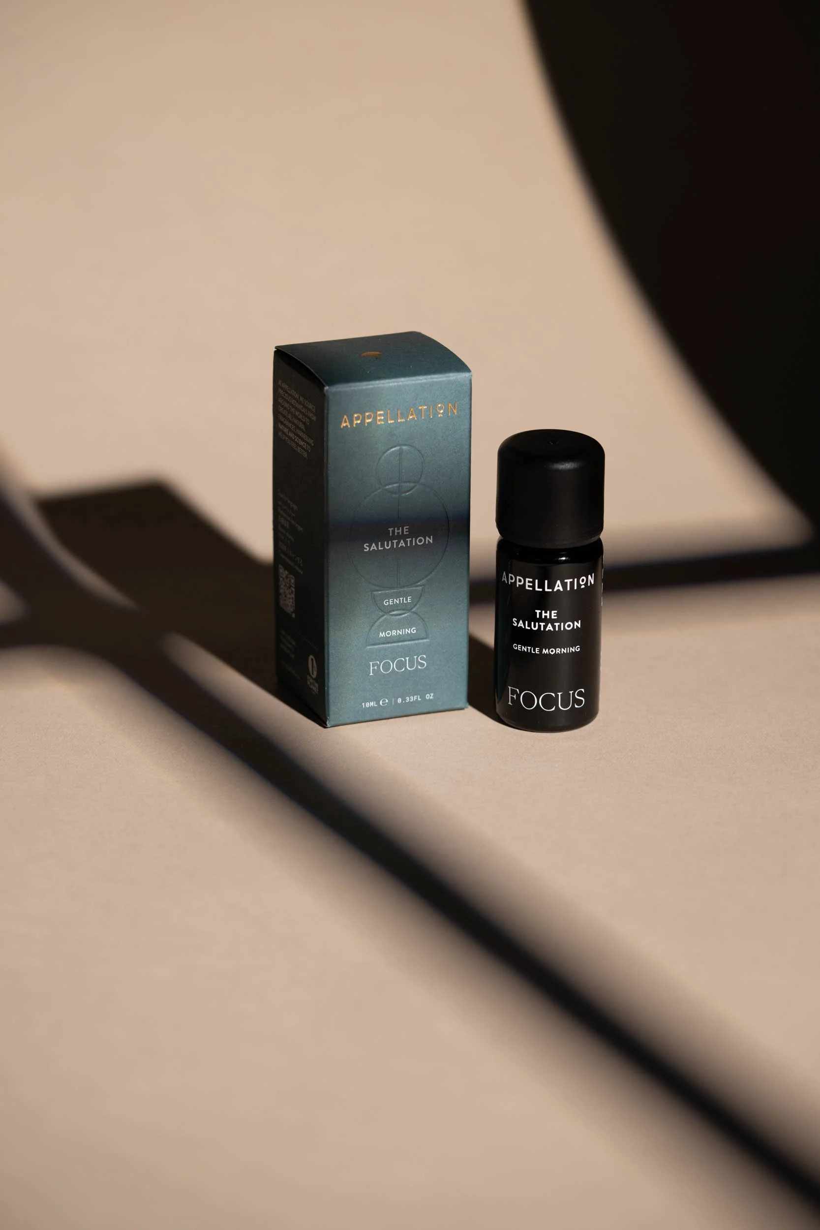
The new packaging system reflects Appellation’s minimalist sophistication while offering clear differentiation across their product lines.
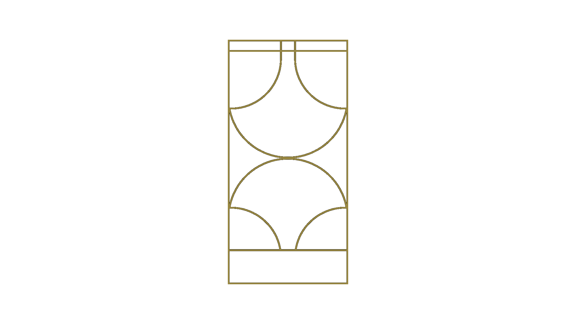
Our design direction was inspired by the brand’s cultural layers: the geometric elegance of Czech Art Deco, a nod to the founders’ heritage, paired with the quiet restraint of Japanese minimalism, reflecting the purity and precision of natural perfumery.
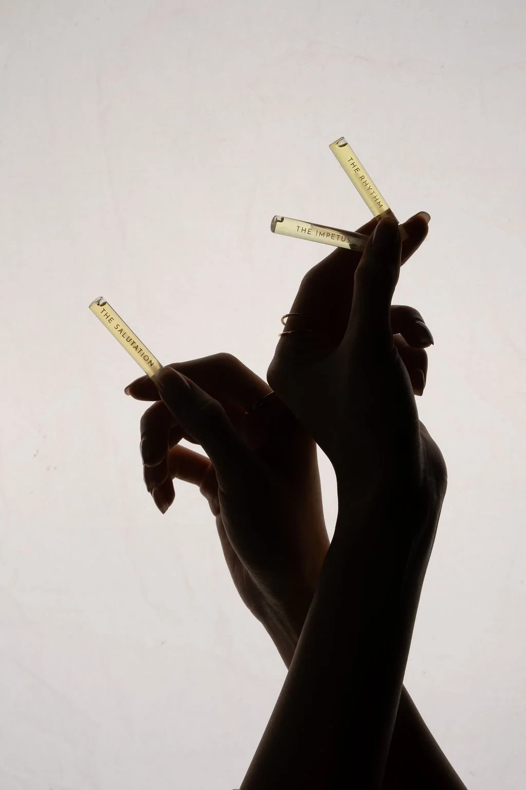
Each series (Single Origin, Calm, Focus, Editions) was given its own motif, allowing them to live together as a cohesive ecosystem while remaining individually distinct. The interior of each box reveals a hidden pattern—an element of surprise and discovery to elevate the unboxing experience.
Every detail was designed to create a subtle sense of ritual and discovery.
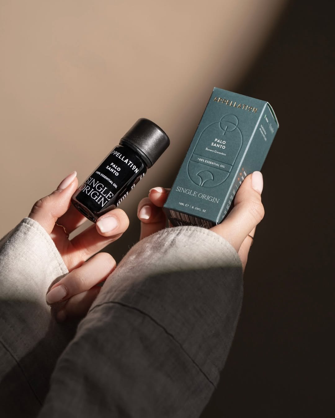


Sustainability through materials
Appellation’s commitment to conscious luxury runs through every layer of its packaging. To embody this ethos, we selected Favini Shiro Echo Bright White, an uncoated, 100% recycled paper that brings a tactile, grounded quality to the design.
Its soft matte finish contrasts beautifully with the refined gold foil and crisp debossing, allowing each detail to shine while maintaining a minimalist, elevated feel. With its FSC™ certification and biodegradable properties, the material choice reflects Appellation’s values, proving that luxury and sustainability can (and should) coexist seamlessly.


Production & Details
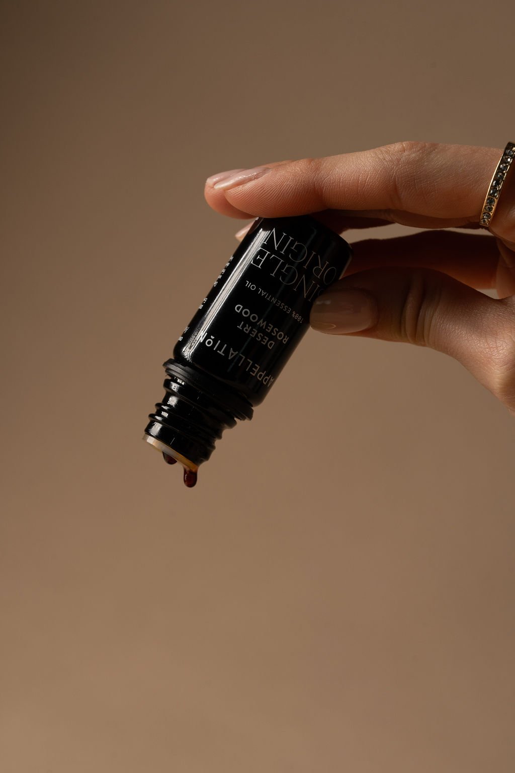
We worked closely with Appellation’s team and local printers in Dubai to fine-tune every dieline, fold, and finish, ensuring the bottles would feel secure, elevated, and delightful to hold.
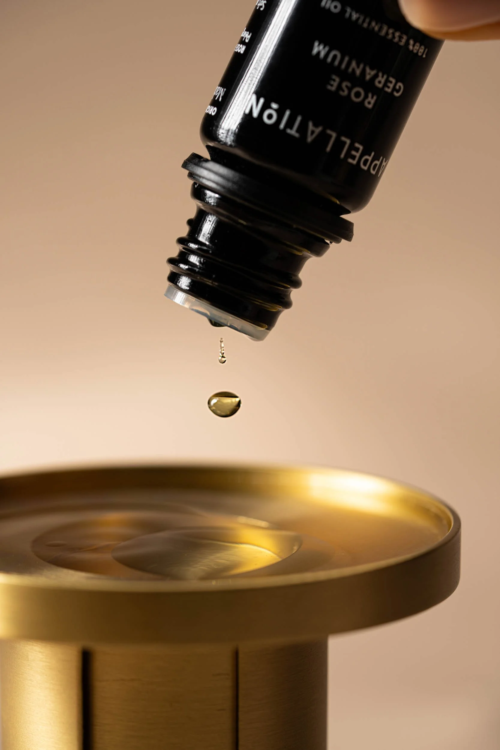
We opted for silk-printed typography on biophotonic glass bottles to remove the need for labels, reducing waste while allowing the design to shine. A clean serif font brings a new sense of considered elegance to the brand – minimalist, refined and enduring.
Each essential oil bottle was printed in white for maximum clarity and contrast—prioritizing legibility while maintaining an elegant, modern aesthetic.
From dielines to drop counts, every touchpoint was crafted to express the same intention that Appellation puts into its blends: slowing down, reconnecting with yourself, and embracing the sensory beauty of everyday life.


Thank you for watching!
Photography © appellation

Let’s work together
Whether you’re a dreamer, a doer, or a wholehearted mix of both, we’ll create the brand of tomorrow — together.
↓