
Japan Objects
A refined packaging system inspired by Japanese tradition, tactility, and timeless beauty.
Japan Objects is a platform that celebrates the soul of Japanese culture—through literature, art, craftsmanship, and timeless design. When they reached out to develop a packaging suite for their most iconic pieces—ranging from art prints to hand-sewn kimono jackets—the request was clear: create something rooted in heritage, rich in detail, and quietly luxurious. A system that could resonate both within Japan and far beyond.
The vision was to create more than protective wrapping. It was about crafting a sensory experience—one that begins the moment the package is received and unfolds with reverence, softness, and care. A visual and tactile journey echoing the values of harmony, subtlety, and intentionality.

Designing with cultural memory
Every element was designed with intention, care, and deep cultural respect.
Drawing inspiration from traditional washi patterns, calligraphic gestures, and the poetry of restraint, the packaging system blends visual simplicity with tactile richness.
We looked to traditional Japanese aesthetics as our north star—taking cues from the Shippo (七宝) motif, which represents interconnectedness and eternity, as well as from the graceful gestures of calligraphy, ceremonial wrapping practices, and the textures of handmade washi paper. From these elements, a unified system of packaging was born.

A tactile ritual of unboxing
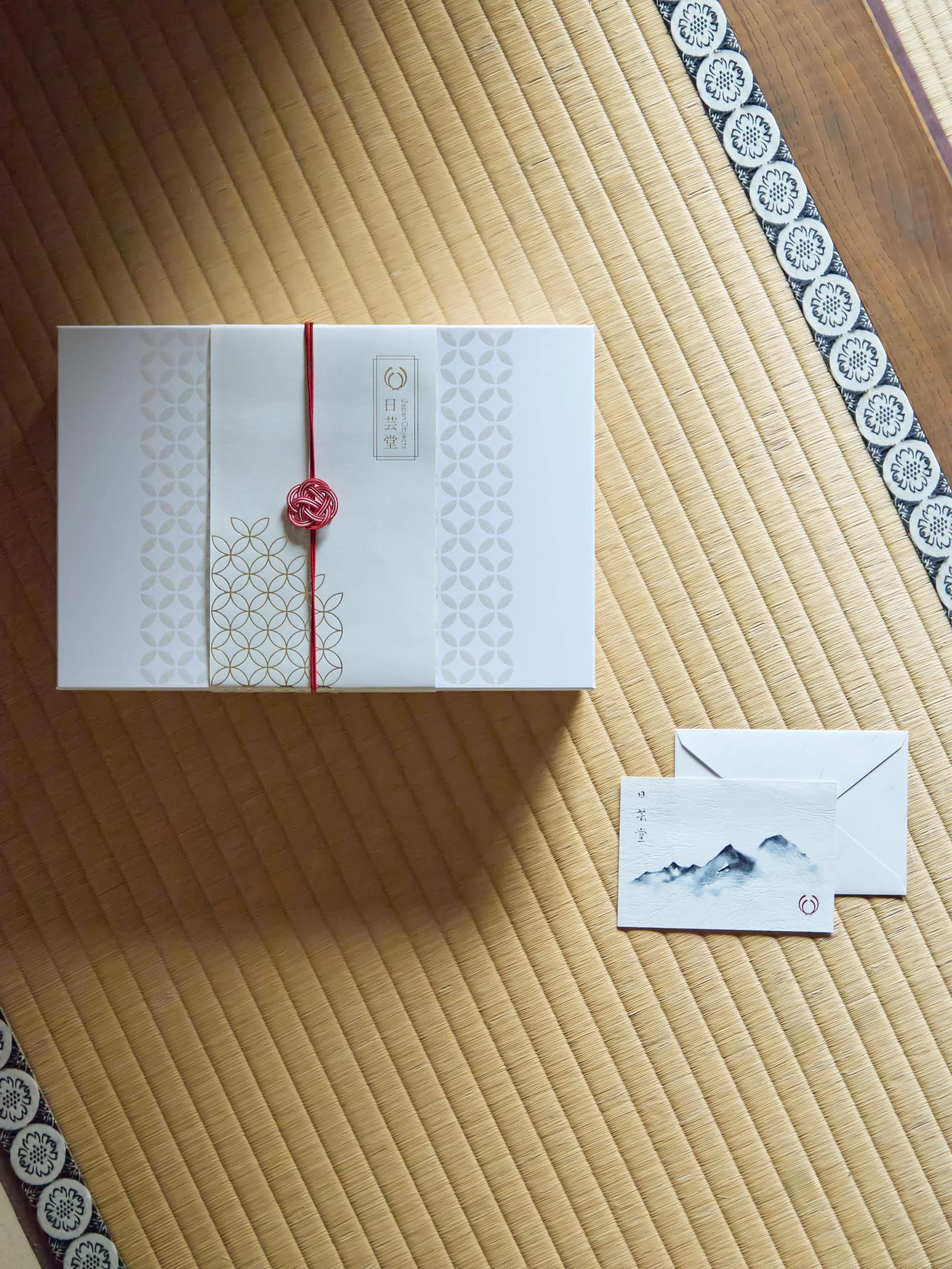
The gift box was designed with a foil-embossed Shippo pattern in soft pearl white, subtle against the pristine lid. At its center, a gold foil logo appears framed by the motif, offering a moment of surprise and beauty upon opening.

The outer obi belt, printed on tactile uncoated paper, wraps the box like a kimono sash—secured with a red mizuhiki cord and seal, evoking the care of a ceremonial gift.

Floral symbols,
folded elegance
Rice bags were designed to feel generous yet refined, made from durable folded paper and screen-printed with bold red floral motifs—a nod to Japanese mon (family crests) and seasonal symbolism.
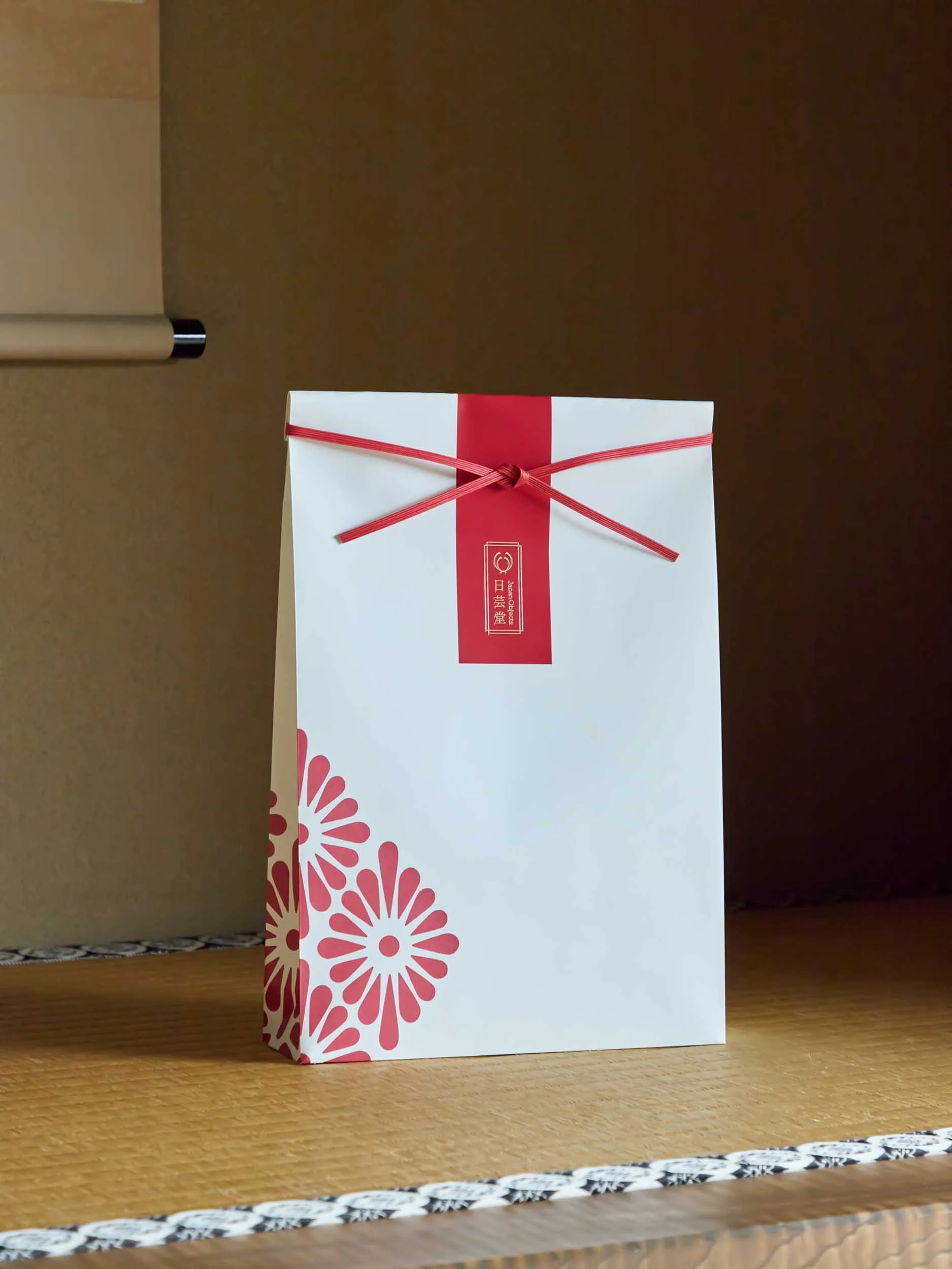
Every fold was studied to ensure the pattern remained balanced and elegant, whether the bag stood tall or was folded lower for smaller contents. Vertical stickers add structure and rhythm, referencing the aesthetics of omiyage wrapping.
Quiet details, lasting impressions
To complete the suite, we designed custom stickers, labels, and a delicate thank you card featuring an original sumi-e style ink landscape, printed on textured paper—a quiet expression of appreciation, embodying the Japanese spirit of thoughtfulness.

Beauty with purpose
Each element was designed with flexibility in mind, allowing for variations in size and usage, while maintaining a consistent visual language. Sustainability was a guiding principle—avoiding plastic, minimizing inks, and relying on natural finishes and textures wherever possible.


“The design really captures the look we were going for, and it is an excellent practical solution too - a lot easier to use than the old packaging was! We are really delighted with how it turned out, and it was a great pleasure to work with Giada again!”
— Diccon Sandrey, Managing Director | Japan ObjectsPhotography © japan objects


Let’s work together
Whether you’re a dreamer, a doer, or a wholehearted mix of both, we’ll create the brand of tomorrow — together.
↓