Luca Scarcella x Insuperlabel 2025
Crafted in honour of Italian mastery
A luxury label created for master baker Luca Scarcella, celebrating 30 years of artisanal excellence.
Developed for Insuperlabel 2025, this award-winning design bridges tradition and innovation through craftsmanship, sensory storytelling, and Italian soul.

A Slow-Baked story of Italian craft and quiet luxury
Born from patience, precision, and poetry
When the brief arrived — to reinterpret Babà in Vasocottura, a beloved Italian dessert slow-baked in glass — I felt an immediate connection.
It wasn’t just about design. It was about values I deeply resonate with: patience, mastery, time, and the poetry of process.
After over a decade abroad, returning to Italian craftsmanship through this project felt like coming home.
And while my studio often moves between the worlds of beauty, wellness, and lifestyle, this marked my first step into the food and beverage industry, an area I’ve long been fascinated by and am excited to keep exploring.
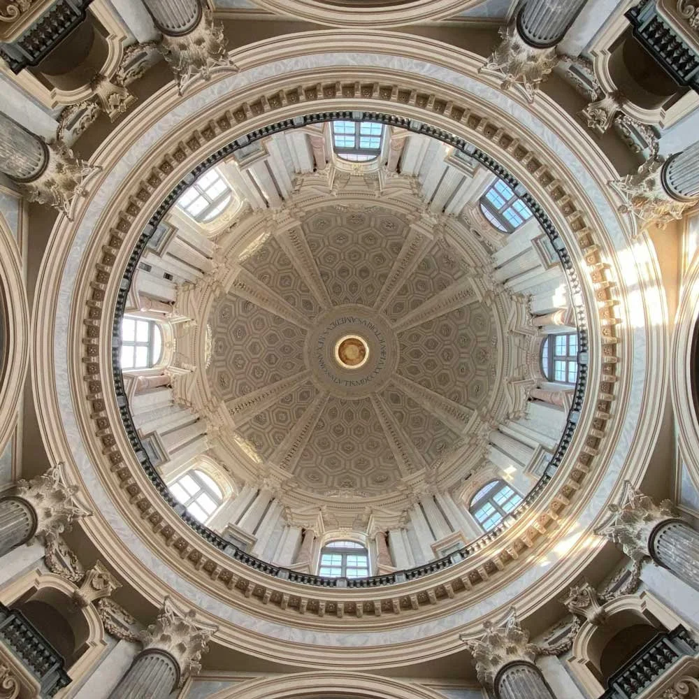

vault of basilica di superga, Turin, ItalyPortone del melograno, Turin, ItalyPhotograph by Enryonthecloud, 2017.


Portone del diavolo, Turin, ItalyPhotograph by Mario Gabinio,1933. Courtesy of Fondazione Torino Musei – Fondo Gabinio. (CC) BY 3.0 IT
chiesa dei santi martiri, Turin, ItalyDoors to timelessness
A story shaped by the ornate doors and timeless details of Turin.
The concept was born from a simple yet profound vision: to design a label that feels alive.
A label that captures the rhythm of craftsmanship, the tactile beauty of materials, and the quiet elegance of time.
Inspired by the ornate doors of Turin, where Luca Scarcella’s bakery was founded, the design transforms architectural details into symbols of heritage, care, and timeless artistry.

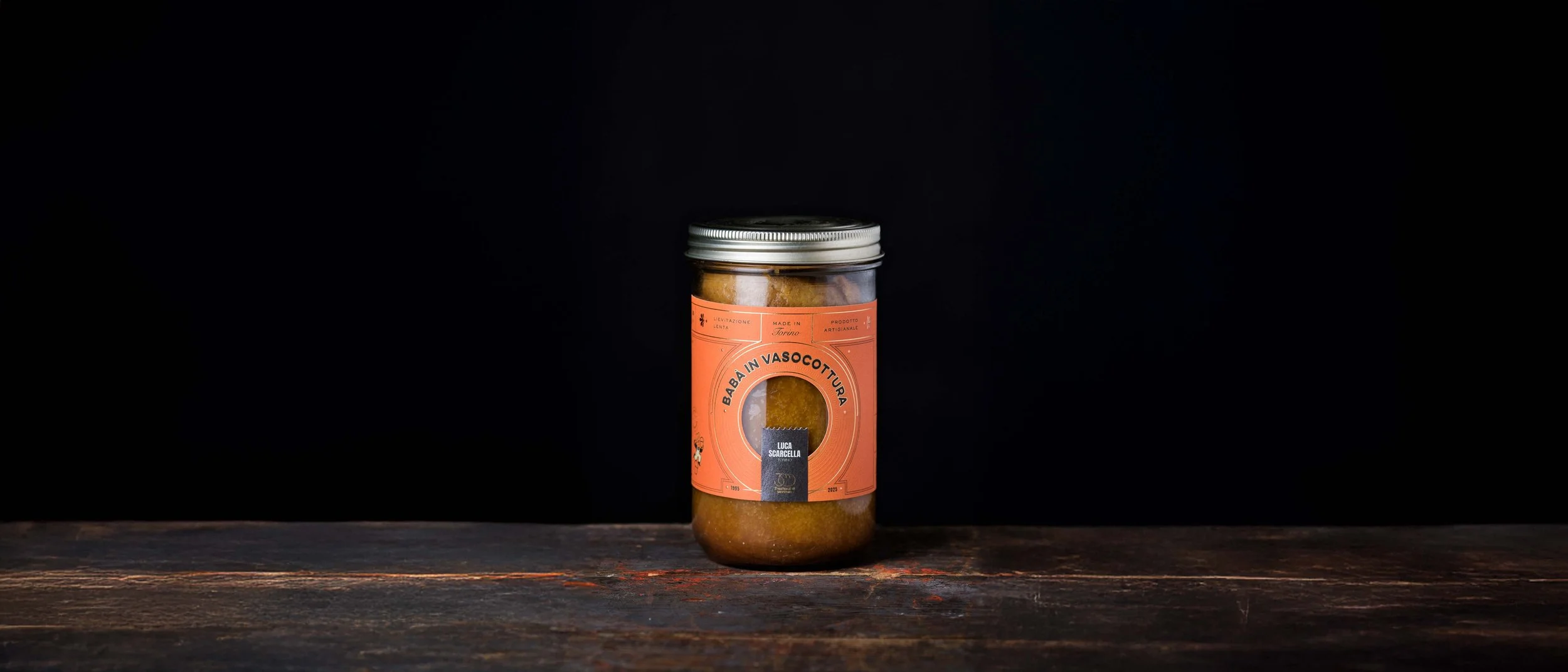
From sketch to structure, the Babà in Vasocottura label comes to life through a meticulous balance of geometry, warmth, and storytelling.
The dieline and palette reflect the artisanal ingredients: cream, toasted orange, cocoa brown, and black. ‘L’omino Scarcella,’ the illustrated baker, embodies joy and craft, shifting pose in every print through HP Mosaic technology.
A window to wonder
Inviting curiosity, nostalgia, and the quiet joy of watching beauty take shape.
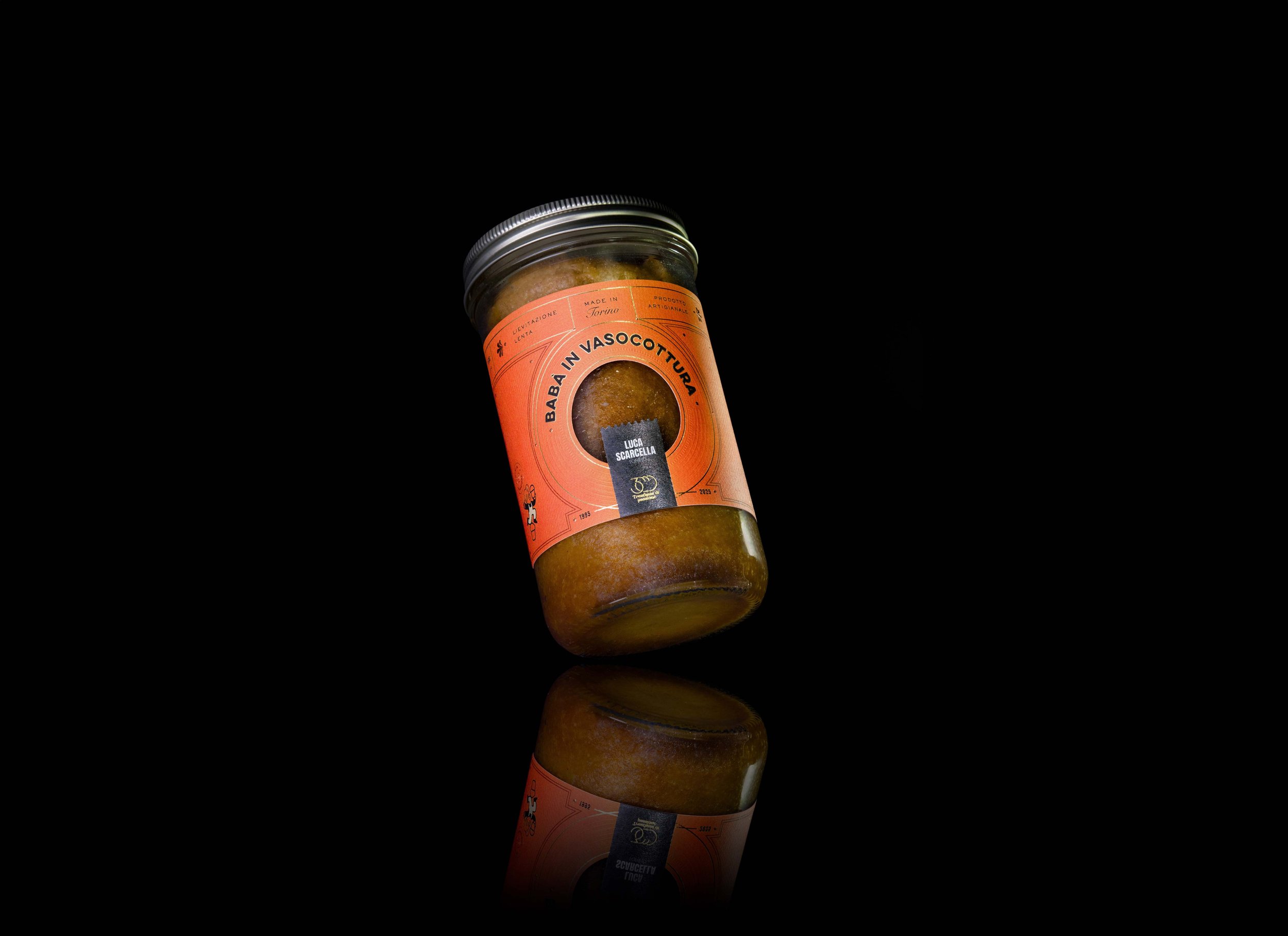
At its centre lies a small circular window, an opening that invites curiosity and wonder, much like the inner child watching dough rise.
Each label features a playful illustrated baker, ‘L’omino Scarcella’, who changes pose in every print thanks to HP Mosaic variable data technology, a tribute to the beauty of imperfection and the uniqueness of handmade work.

Printed at Auroflex in Sicily, each label was brought to life with precision, care, and a sense of wonder. From testing colours to feeling the first embossed sheets, this moment marked the bridge between imagination and reality, where craftsmanship becomes a shared language of beauty and devotion.
Where design meets touch
A celebration of light, detail, and devotion.
Every detail was crafted with purpose, to evoke the sensory pleasure of craftsmanship and the devotion behind Italian artistry.
Printed with mastery and exquisite care for detail by Auroflex, in Sicily, using HP Digital Print, the label comes alive through intricate embossing and foils by Luxoro – Leonhard Kurz, creating a dance of light and texture.
The chosen substrate, Cotone Bianco Sabbia Ultra WS from Manter by Fedrigoni, is a 100% natural cotton paper treated with Ultra WS and anti-fungus coating, designed for glass containers yet delicate to the touch.
Its natural texture and weight mirror the artisanal quality of the product itself: soft, refined, and enduring.
The warm orange, cocoa brown, and soft beige palette echoes the tones of the product and Scarcella’s brand identity, blending authenticity with understated luxury.
Printed at Auroflex in Sicily using HP Digital Print, the Babà in Vasocottura label takes shape through foil, emboss, and motion. A seamless choreography of craft and technology.

A digital render capturing the tactile soul of the Babà in Vasocottura label — where light, texture, and storytelling meet.
Sustainability as sensibility
Less noise, more intention
For me, sustainability begins with intention. It’s not only about material choices, but about designing with care, longevity, and purpose.
Here, every decision was intentional:
– Minimal foil to preserve recyclability.
– Embossing to elevate tactility without excess.
– Digital printing to reduce waste and enhance creative freedom.
Sustainability, at its finest, is a form of elegance, it’s beauty that endures.

An unforgettable moment shared with part of the Insuperlabel 2025 jury — Laura Moretti, Laura Buddensieg, and Gianfranco Adamo.
Where design meets heart
Winner of Insuperlabel 2025.
A tribute to collaboration, craftsmanship, and the timeless beauty of doing things slowly.
Winning the Insuperlabel 2025 Award was an honour, but the real reward was the journey.
Seeing the label come to life on press at Auroflex’s facilities in Sicily — from foil to emboss, from precision to passion — was one of those rare moments when design feels almost sacred.
This project became a reminder of why I do what I do: to create meaning through form, emotion through touch, and connection through craft.
When design meets heart, something timeless is born.
The award-winning Babà in Vasocottura label — a celebration of Italian craftsmanship and time.
Printed on Cotone Bianco Sabbia Ultra WS by Manter by Fedrigoni, with copper foil and embossing by Luxoro Kurz, the design invites touch and reflection through its warm hues and circular window.

Credits
Client: Luca Scarcella
Contest: Insuperlabel 2025
Award: Winner – Insuperlabel Label Design Contest 2025
Print: Auroflex
Paper: Manter by Fedrigoni – Cotone Bianco Sabbia Ultra WS
Foils and embossing plates: Luxoro – Leonhard Kurz
Technology: HP Digital Print
Design: Giada Tamborrino Studio

Let’s work together
Whether you’re a dreamer, a doer, or a wholehearted mix of both, we’ll create the brand of tomorrow — together.
↓