Celebrating Italian artistry: Giada Tamborrino wins Insuperlabel 2025
14 october 2025 
Insuperlabel 2025, a competition dedicated to excellence in luxury label printing and packaging design.
A celebration of craftsmanship, time, and Italian excellence
I’m still processing it all, but it’s official:
Giada Tamborrino Studio has won Insuperlabel 2025. 🏆✨
A journey that began with an idea has become a celebration of Italian artistry, patience, and the beauty of making things by hand.

A full-circle moment I’ll never forget. Holding the Insuperlabel 2025 Winner Award still feels surreal — a celebration of craftsmanship, storytelling, and the beauty of Italian design.
The contest: where design and craft meet
Insuperlabel is more than a label design competition. It’s a stage for innovation in luxury printing, a space where designers, printers, and partners come together to celebrate craftsmanship, storytelling, and the art of materiality.
This year’s brief invited us to design a luxury adhesive label for master baker Luca Scarcella’s babà in vasocottura, a traditional Italian dessert, slow-baked in glass, that embodies time, mastery, and the poetry of waiting.

The winning Babà in Vasocottura label for Insuperlabel 2025, designed by Giada Tamborrino Studio and printed by Auroflex for master baker Luca Scarcella.
The design celebrates Italian craftsmanship through texture, foil, and form — featuring a custom die-cut window that invites curiosity and evokes the magic of slow baking.

The award-winning Babà in Vasocottura label designed by Giada Tamborrino Studio for the Insuperlabel 2025 contest, printed by Auroflex for master baker Luca Scarcella.
The design captures the essence of Italian craftsmanship and the poetry of slow baking — featuring a circular composition, tactile Fedrigoni cotton paper, and a small window that reveals the dessert within.
Created to celebrate Luca’s 30 years of artisanal excellence, this product captures the essence of his work: the patience of fermentation, the beauty of imperfection, and the joy of sharing something made by hand.
For me, this challenge was about translating those same values into design: creating something that felt alive, sensory, and deeply human.
The concept: a label with soul
"A quiet moment of stillness, of watching dough rise, feeling time slow, and witnessing beauty take shape. That’s what this tactile label seeks to evoke."
--- Giada Tamborrino
Leaving Italy 13 years ago expanded my world. But distance has a way of sharpening what you once took for granted.
Only by stepping away did I truly see it: the quiet devotion, the relentless pursuit of beauty, the kind of craftsmanship that lives in every Italian detail.
It’s something rare, almost sacred, this instinct to perfect, to care, to make even the smallest thing meaningful.
This project was born from that same spirit, from the beauty of patience and the rhythm of Italian craftsmanship. Each element of the label was designed to tell a story: one of time, texture, quality ingredients, and timeless artistry.
My design was inspired by the ornate doors of Turin, the city where master baker Luca Scarcella lives and works, a place rich in history, architecture, and quiet elegance. These doors, with their intricate details and layers of craftsmanship, felt like the perfect metaphor for his work: a dialogue between tradition and innovation, patience and artistry. Their decorative frames became visual storytellers, symbolic thresholds between past and present, heritage and reinvention.
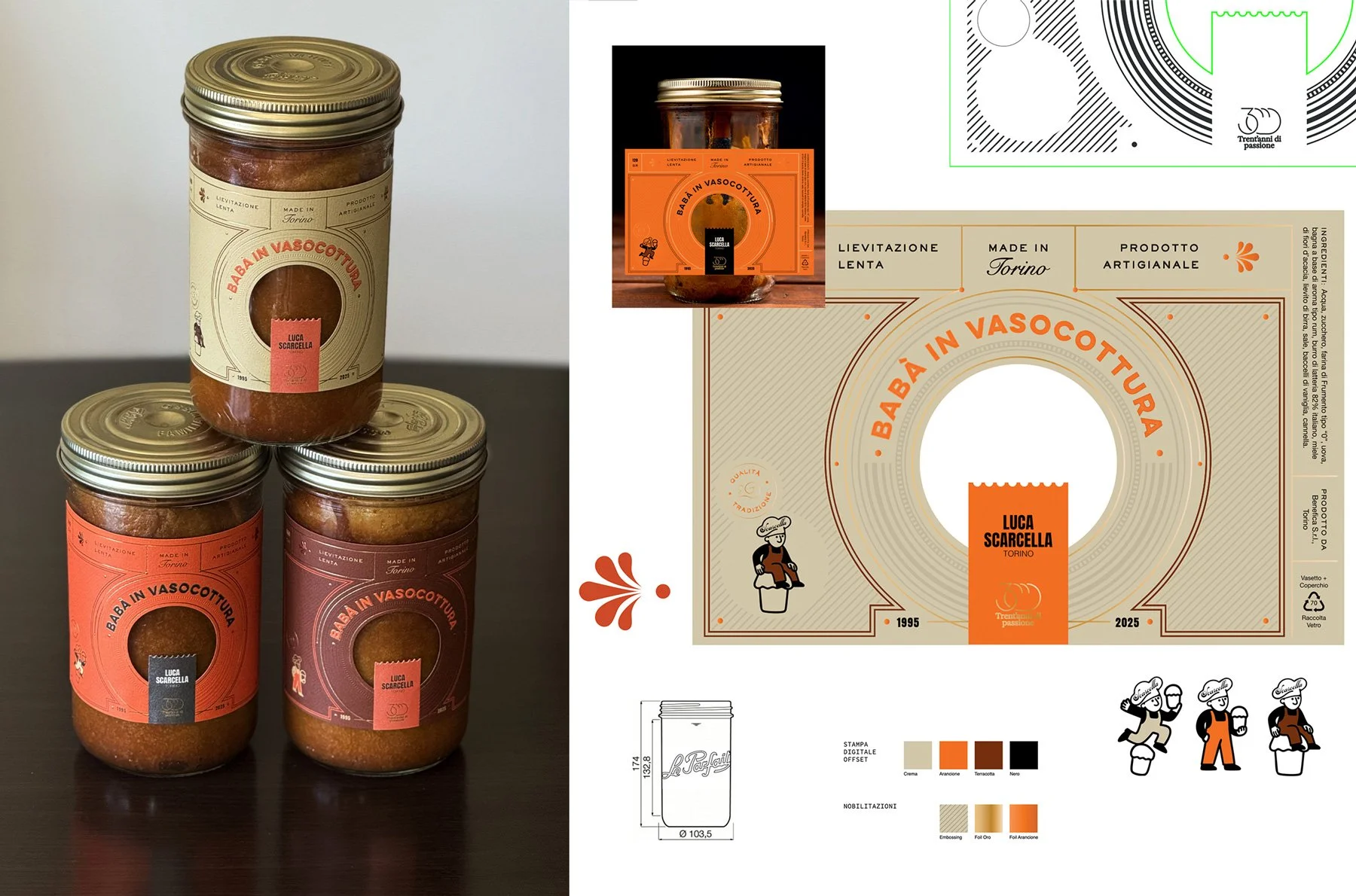
A look at the three label variations designed for the Insuperlabel contest, each celebrating tradition and material storytelling — from die-cut layout to character illustrations and embossing with foil finishes.
At the heart of the label lies a small window, an opening that invites wonder, much like the inner child who peeks to see a dessert rise. It lets us taste the product before we even try it, through light, texture, and anticipation.
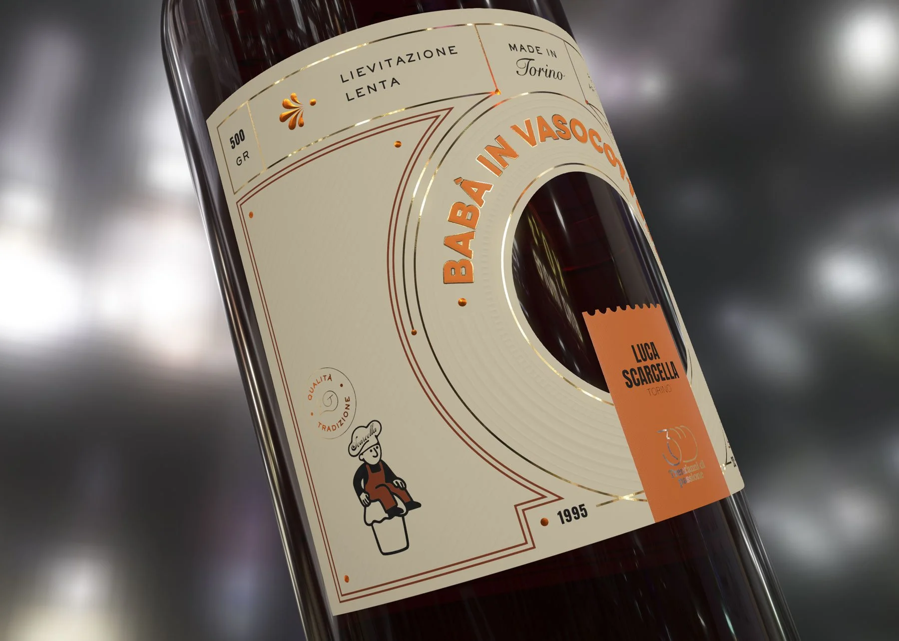
Close up of a digital 3D mockup of the label design for babà in vasocottura, showing layout, embossing, and foil placement
Each label is printed on Fedrigoni cotton paper, combining warmth with tactility. Gold and terracotta foils by Luxoro – Leonhard Kurz, paired with intricate embossed elements, bring depth and contrast.
The design unfolds in three colour variations, orange, brown, and beige, drawn from the brand’s identity and inspired by the tones of baked dough, caramelised sugar, and cream. Through HP Mosaic variable data technology, these variations and the illustrated baker figure (l’omino Scarcella) change with every print, ensuring that no two labels are ever the same, just like artisanal creations made by hand.
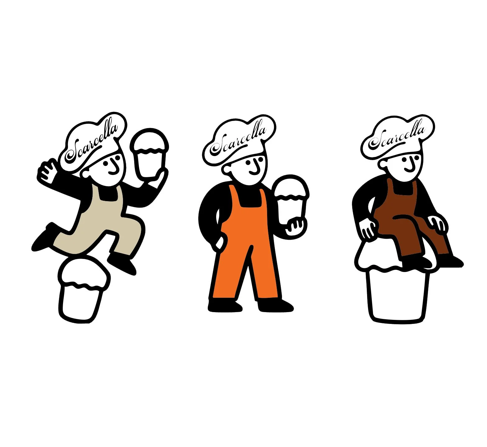
The illustrated baker Scarcella, a modular design element that changes position and outfit to create a dynamic, playful data variation.
To bring the vision to life before hitting the press, I developed a series of 3D mockups using DreamComposer by Kurz. These mockups allowed me to explore light, texture, and label interaction at a sensory level, helping envision the final concept with clarity and depth.
From idea to print: Sicily, July 2025
Seeing the label come to life in Sicily, printed by the expert hands at Auroflex Srl, was a moment I’ll never forget. From foil to emboss, paper to precision, I watched care turn into craft, and craft into something alive.

Moments from Sicily in July 2025, where passion met precision. From press checks to foil runs, watching the label come to life at Auroflex was pure magic. ✨
That’s where the real magic happens: when human sensitivity meets printing mastery, and design transcends the digital to become tangible, tactile, real.
As part of this phase, I flew to Sicily to oversee the production with Auroflex, where the labels were brought to life using:
Digital offset printing (HP Indigo)
Self-adhesive Fedrigoni materials
Luxoro’s foil collection
Being hands-on during the print phase made the project feel even more real, a tactile reminder that great packaging happens where creativity meets process and intention.
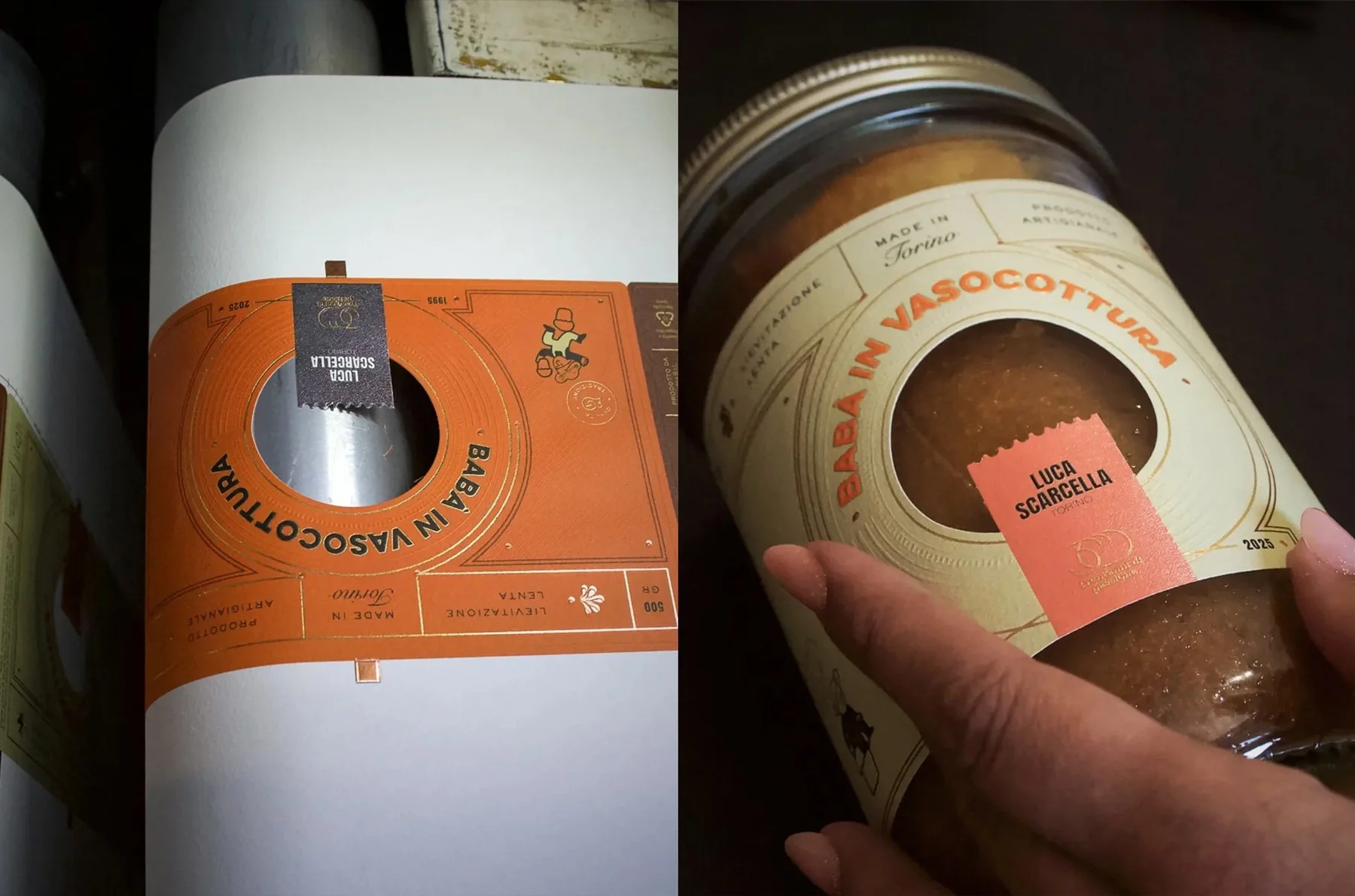
From print to product — the orange label version during the production phase and the final cream version applied to the jar, showcasing tactility and precision.
Below you can watch a video of the machine in action, bringing the vision to life with precision and passion.
The award ceremony
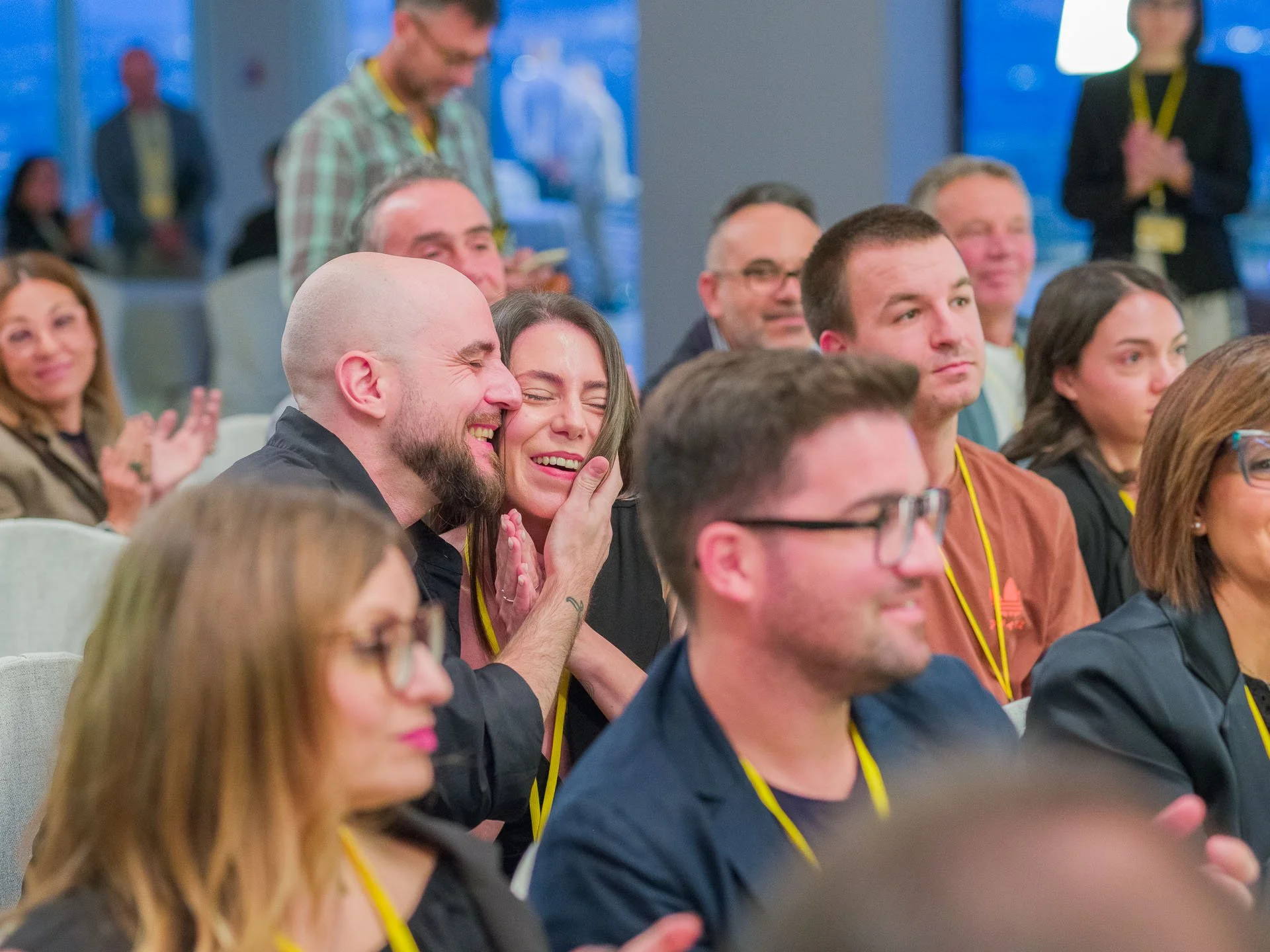
The final ceremony was held on the 9th October 2025 in Castellammare del Golfo, Sicily, and it was pure emotion.
Being surrounded by such talented designers, seeing our work celebrated in one place, and feeling the passion that connects us all, it was truly special.
The exact moment my name was announced. Tears, laughter, disbelief, all at once. Having my husband Alessandro by my side made it even more special. This moment will stay with me forever.
The jury, composed of Laura Buddensieg, Gianfranco Adamo, Cristina Vannini Parenti, Laura Moretti, and Vincenzo Russo, brought together extraordinary expertise, from visual communication and branding to neuromarketing and creative direction.
To be recognised by such esteemed professionals is an honour I’ll carry with me always.


Gratitude
My heartfelt thanks to Insuperlabel the jury, Luca Scarcella, Auroflex Etichette, Manter by Fedrigoni, Luxoro Kurz, and HP Digital Print for making this project possible, and for proving that true innovation begins with collaboration.
And to my friends, family, clients and collaborators, thank you for being part of this dream. 💛
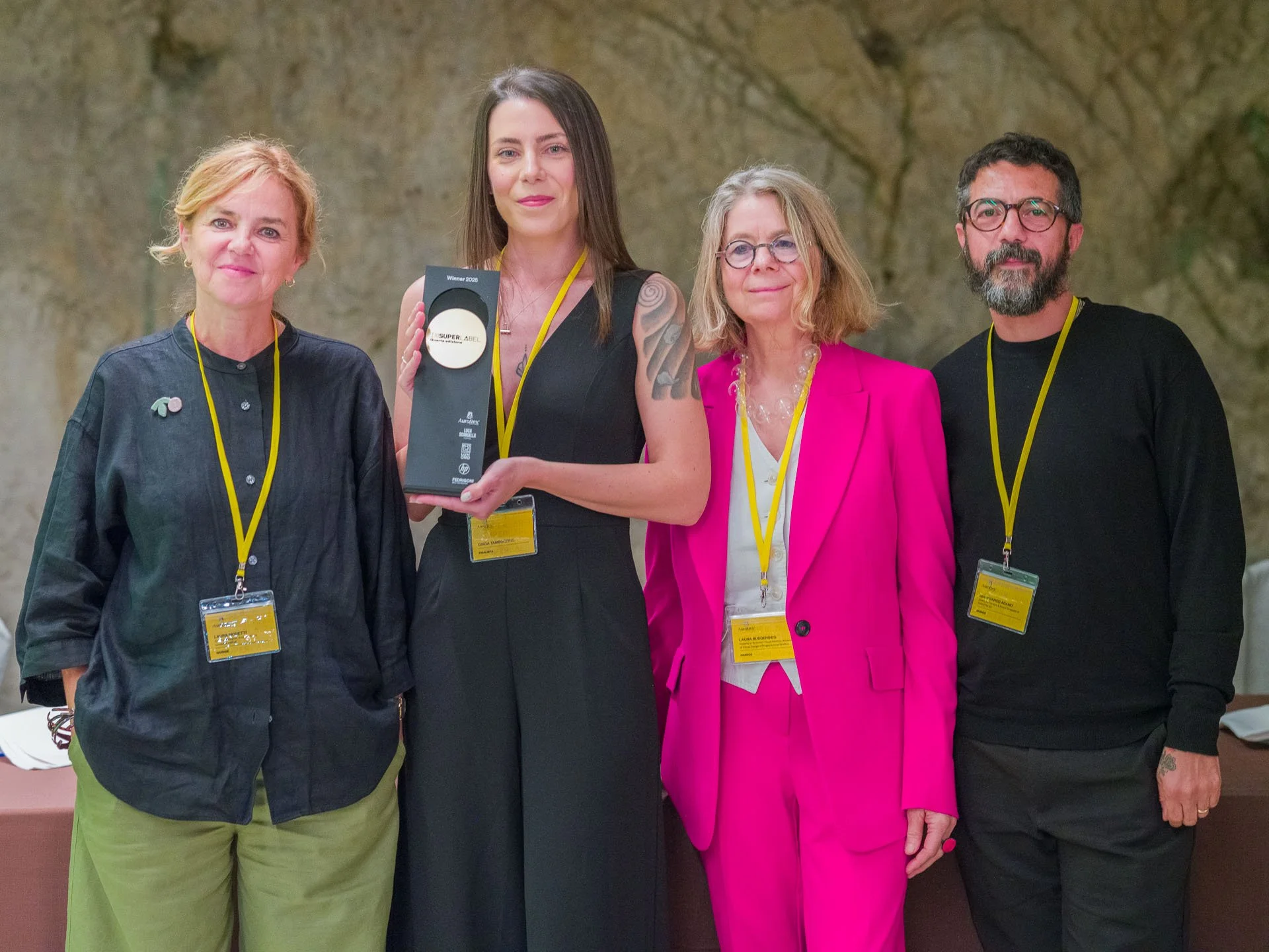
An unforgettable moment shared with part of the Insuperlabel 2025 jury — Laura Moretti, Laura Buddensieg, and Gianfranco Adamo. Their recognition and words meant the world to me. To be acknowledged by such talented professionals, each with a remarkable eye and career, is an honour I’ll cherish deeply.
Reflecting on the beauty of slowness
In a world that moves fast, this project reminded me that design, like baking, is an act of patience. It’s about giving time and attention to what matters, embracing slowness as a form of luxury.

All finalist designs for Insuperlabel 2025, each reinterpreting Luca Scarcella’s Babà in Vasocottura through a unique creative lens. A tribute to craftsmanship, innovation, and the beauty of Italian design — where tradition meets experimentation, and every label tells its own story. A collaboration between designers, printers, and partners celebrating the art of label design.
Printed by Auroflex Srl for master baker Luca Scarcella, Torino.
This award is more than a milestone. It’s a reminder that when design meets heart, and when tradition and innovation move in harmony, beauty becomes timeless.
From Amsterdam to Sicily and back, a journey I’ll never forget. What began as a design challenge became a celebration of craft, emotion, and Italian excellence.
Now, back in my studio, the trophy sits quietly. A reminder of what’s possible when design meets heart.
You can watch a short video of the journey to the ceremony and back below, a glimpse of all the emotion, beauty, and magic that made this experience unforgettable.
Share on
Related articles