Behind the Scenes of GT Studio Finalist Design for Insuperlabel
27 july 2025 
Insuperlabel 2025, a competition dedicated to excellence in luxury label printing and packaging design.
A celebration of craftsmanship, storytelling, and Italian excellence in label design
I’m incredibly honoured to share that Giada Tamborrino Studio has been selected as one of the 8 finalists in Insuperlabel 2025, a prestigious design contest dedicated to luxury label printing and packaging innovation, celebrating craftsmanship and storytelling with an Italian soul.
As part of the final phase, I flew to Sicily to oversee the production with Auroflex. I’m still holding onto the magic of that moment: seeing my label design come to life, watching it roll out of the press with embossing, hot foil, and cotton paper elevating every detail.
This wasn’t just any packaging design contest. It was a deep-dive into Italian heritage, craftsmanship, and innovation.

Moments from Sicily, where passion met precision. From press checks to foil runs, watching the label come to life at Auroflex was pure magic. ✨
This year’s brief asked us to design a label for babà in vasocottura, a traditional Neapolitan sponge cake, slow-baked in a jar. The product was created by the brilliant Luca Scarcella, a master baker from Turin who’s spent over 30 years championing artisanal pastry.
When Insuperlabel 2025 announced their theme, I knew I wanted to create something more than beautiful. I wanted to capture intention. Emotion. A sense of presence.
The Concept: A Label with Soul
"A moment of stillness, of watching dough rise. That’s what the label evokes."
--- Giada Tamborrino
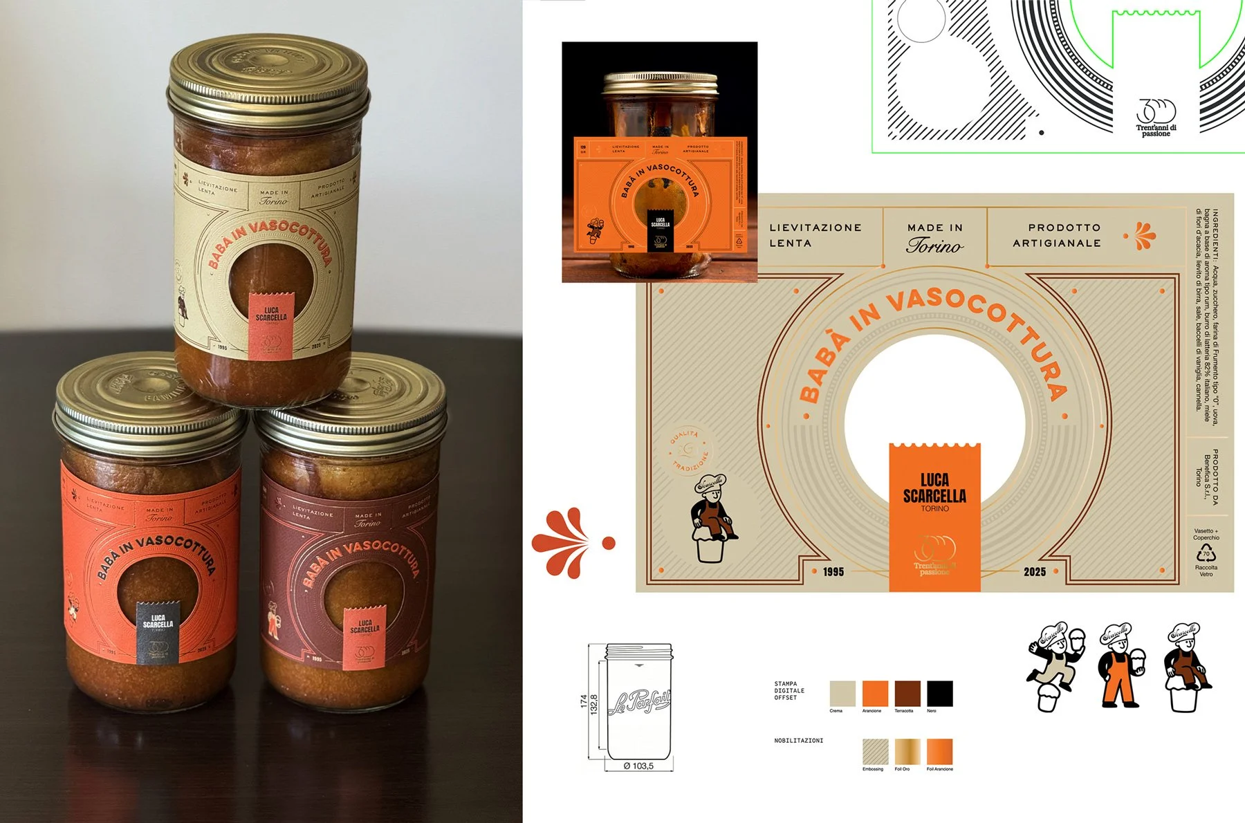
A look at the three label variations designed for the Insuperlabel contest, each celebrating tradition and material storytelling — from die-cut layout to character illustrations and embossing with foil finishes.
For this project, I didn’t want to create just a beautiful label. I wanted to design something that feels alive, evoking the slow rise of dough, the joy of discovery, and the timeless ritual of making.
My concept was inspired by the product itself and by the historic doors of Turin: ornate, mysterious, and full of personality. These doorways became metaphors for craftsmanship, identity, and the quiet beauty of everyday rituals.
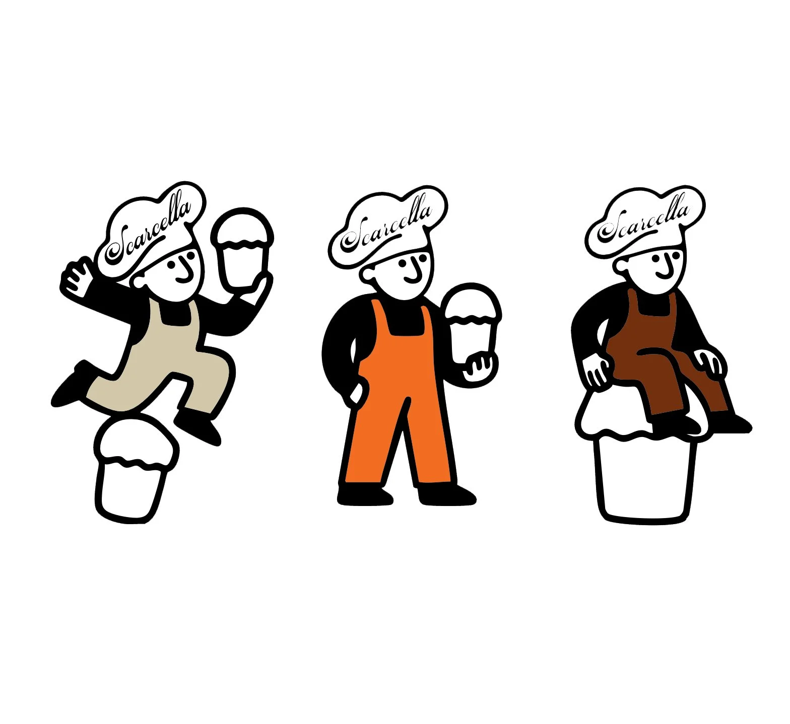
The illustrated baker Scarcella, a modular design element that changes position and outfit to create a dynamic, playful data variation.
From this inspiration, I created:
- A custom die-cut window, symbolising a glimpse into the baking process
- Fedrigoni Cotton paper for a tactile, premium feel
- Gold and terracotta foils paired with deep embossing
- An illustrated character, l’omino Scarcella, who shifts posture and outfit in each print thanks to HP Mosaic’s variable data tech
This label celebrates timeless beauty, craftsmanship, creativity, and the intimacy of small-batch tradition. A slow moment captured in print.
To bring the vision to life before hitting the press, I developed a series of 3D mockups using DreamComposer by Kurz. These mockups allowed me to explore light, texture, and label interaction at a sensory level, helping envision the final concept with clarity and depth.
Printed in Sicily — where innovation meets heritage
As part of the final phase, I flew to Sicily to oversee the production with Auroflex, where the labels were brought to life using:
Digital offset printing (HP Indigo)
Self-adhesive Fedrigoni materials
Luxoro’s foil collection
Being hands-on during the print phase made the project feel even more real, a tactile reminder that great packaging happens where creativity meets process and intention.
Below you can watch a video of the machine in action, bringing the vision to life with precision and passion.
A heartfelt milestone
This wasn’t just about print. It was about slowness and savoir-faire as luxury, about letting design speak softly, with care. This project has reminded me that good design holds space. It doesn’t rush. It welcomes presence.
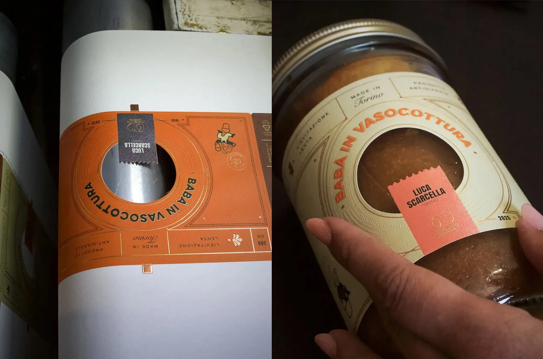
From print to product — the orange label version during the production phase and the final cream version applied to the jar, showcasing tactility and precision.
Being selected as one of the 8 finalists for Insuperlabel 2025 has been an honour, and a moment of deep connection to my roots, my values, and the kind of work I want to keep doing: emotionally intelligent, materially grounded, and timeless.
Gratitude to Insuperlabel, Auroflex, HP Indigo, Fedrigoni Self-Adhesives, Luxoro, and of course, Luca Scarcella for the trust and inspiration.
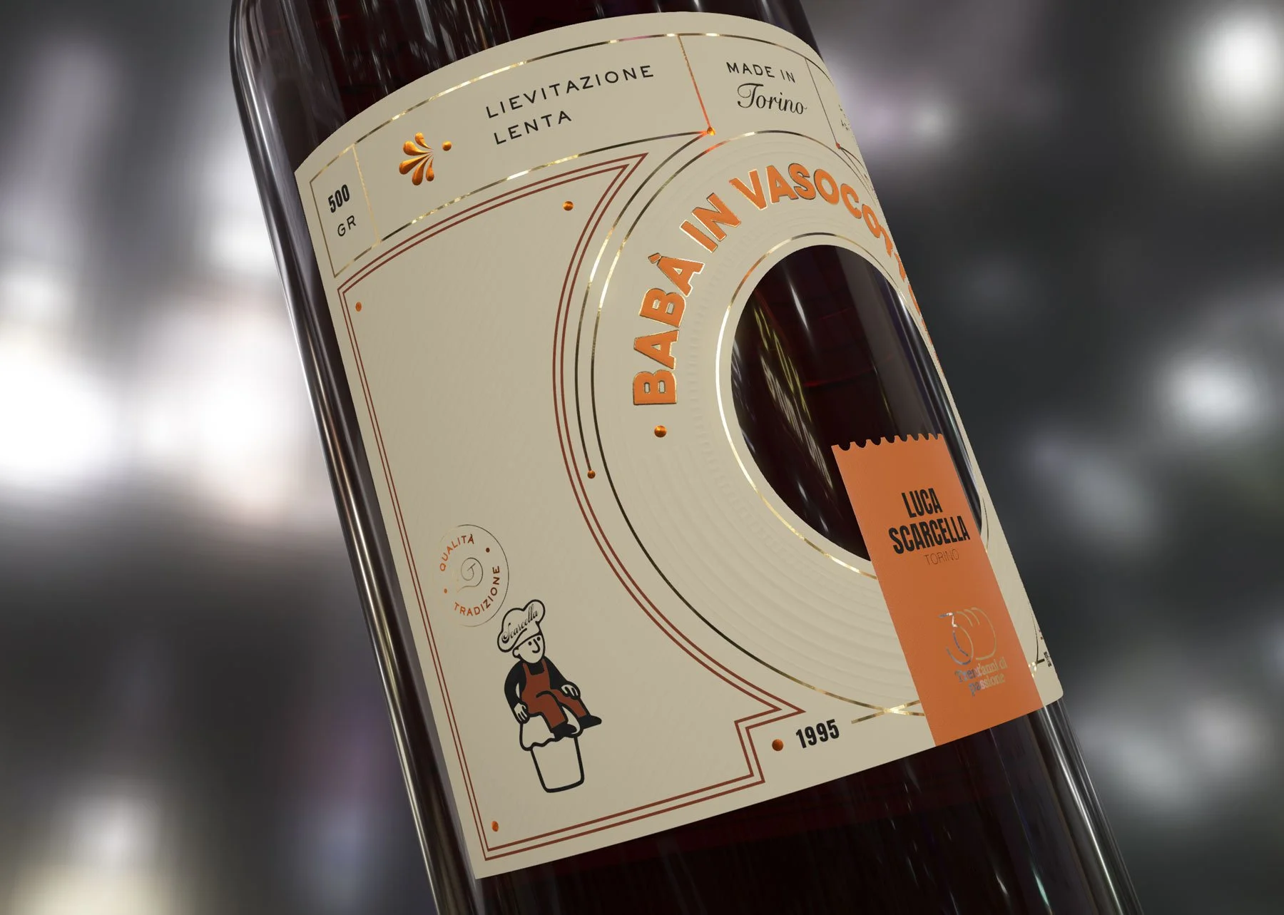
Close up of a digital 3D mockup of the label design for babà in vasocottura, showing layout, embossing, and foil placement
What’s next?
The winner of Insuperlabel 2025 will be announced on October 9th, so stay tuned!
In the meantime, you can watch my short interview with the Insuperlabel team below (Italian audio), or view all the finalists’ designs here.
Share on
Related articles