
RUA
Services
Brand Identity
Packaging Design
Web Design & Development
Featured on
→   Elle Norway
→   Costume Norway
→   Bo Bedre Norway
→   Finansavisen Norway
→   Behance
→   Dieline
→   pentawards
..and more
A packaging system designed around what we keep
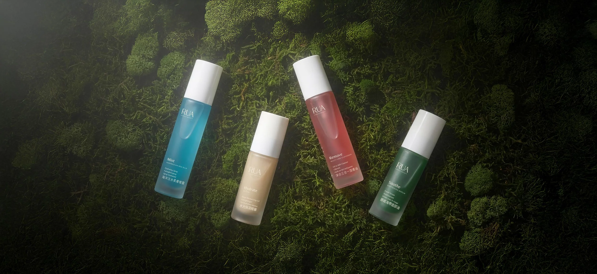
RUA Nordic Beauty brings a thoughtful approach to everyday skincare. Founded in Oslo by formulator Kristina Dunn, the brand pairs its Nordic sensibility with a belief that beauty should be considered in every detail, including the packaging we use along the way.
Building on our original work together, we returned to RUA’s packaging with a question: why should a new bottle always come with a new dispenser?
Rooted in the Nordic landscape
Our collaboration began with a logo, a hand-drawn rue plant, and Kristina’s vision. Inspired by Scandinavia’s deep seas and stormy skies, we developed a visual identity through colour and typography, balancing the expressive illustration with a clean, modern feel.
That foundation continues into this new chapter. The focus has evolved from establishing RUA’s visual world to reconsidering how its packaging lives within a daily ritual.
For RUA, this evolution is an opportunity to bring its values into the way its products are packaged and used. It asks a little more participation from the customer, and brings a more considered rhythm to a familiar act of care.
Our role was to help turn that intention into a tangible system. A new chapter for RUA, shaped by the belief that thoughtful design can change what we expect, what we use, and what we choose to keep.
A different starting point
Beauty packaging often treats the dispenser as part of every purchase. Yet when a bottle is empty, its dispenser may still have a useful life ahead of it. Together with Kristina, we questioned that default and developed a system that gives each component a clearer role.
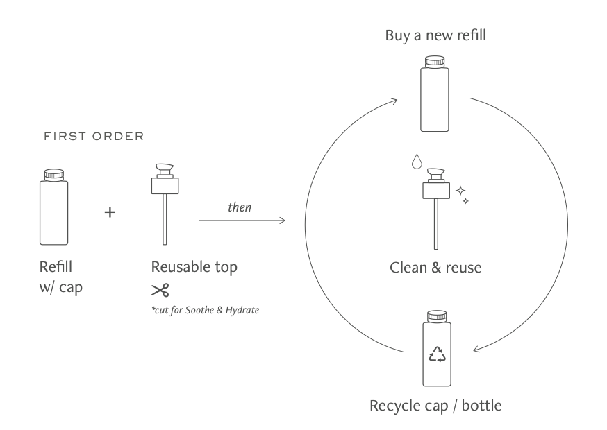
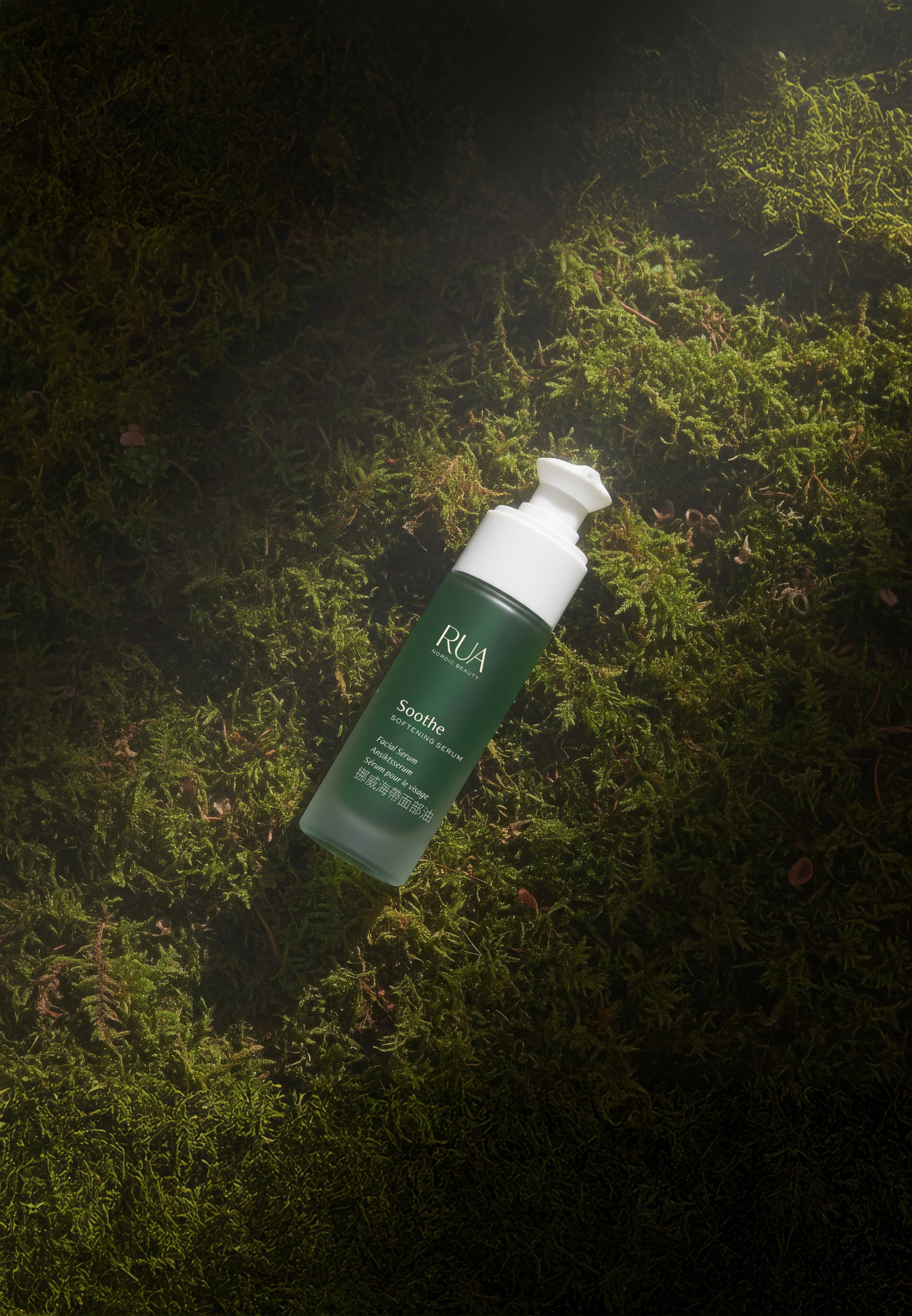
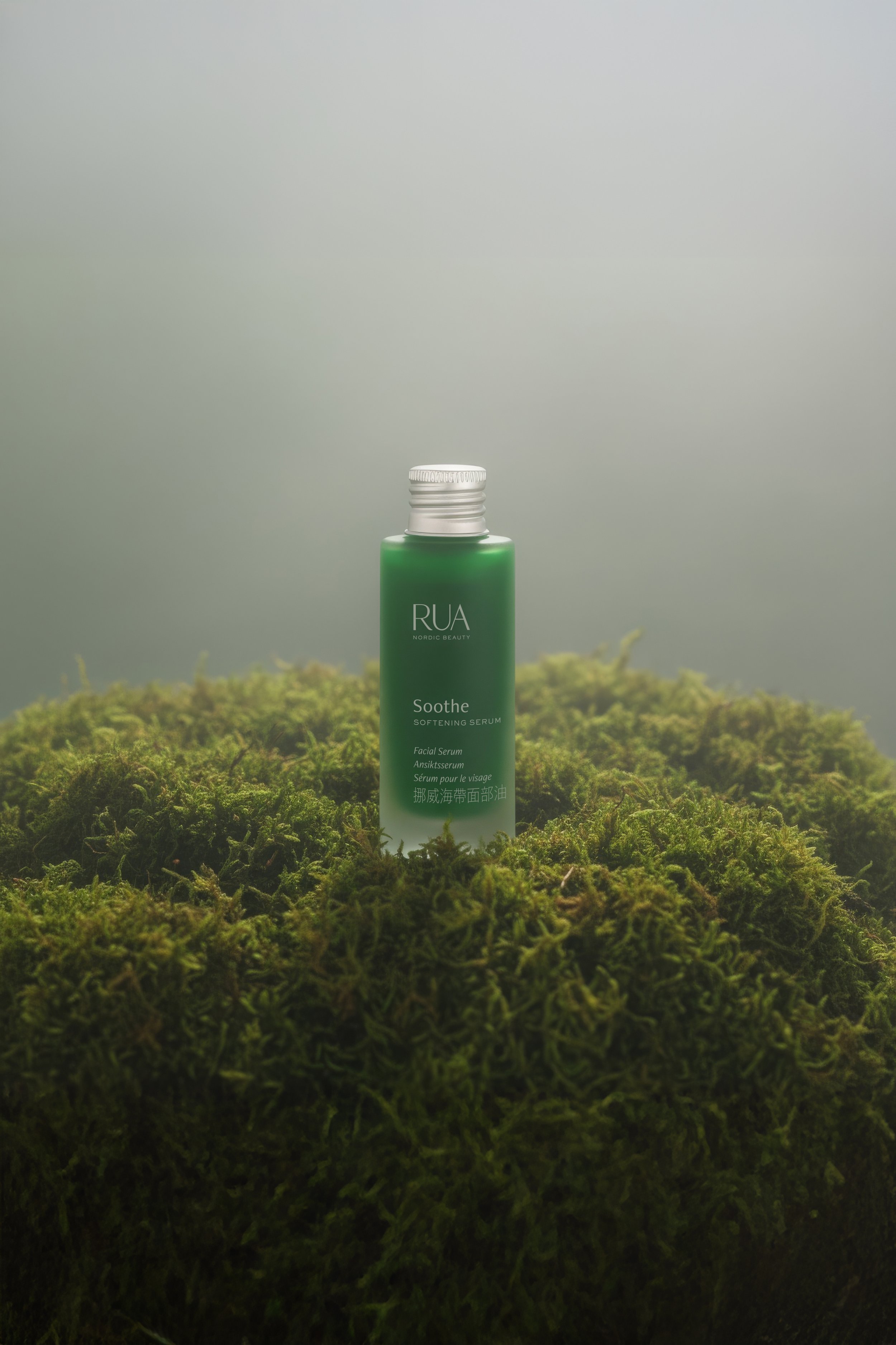
Every glass bottle now comes with an aluminium screw cap as standard. The dispenser is sold separately, purchased once and kept for future bottles. Clean it. Reuse it. Let it become part of the routine.
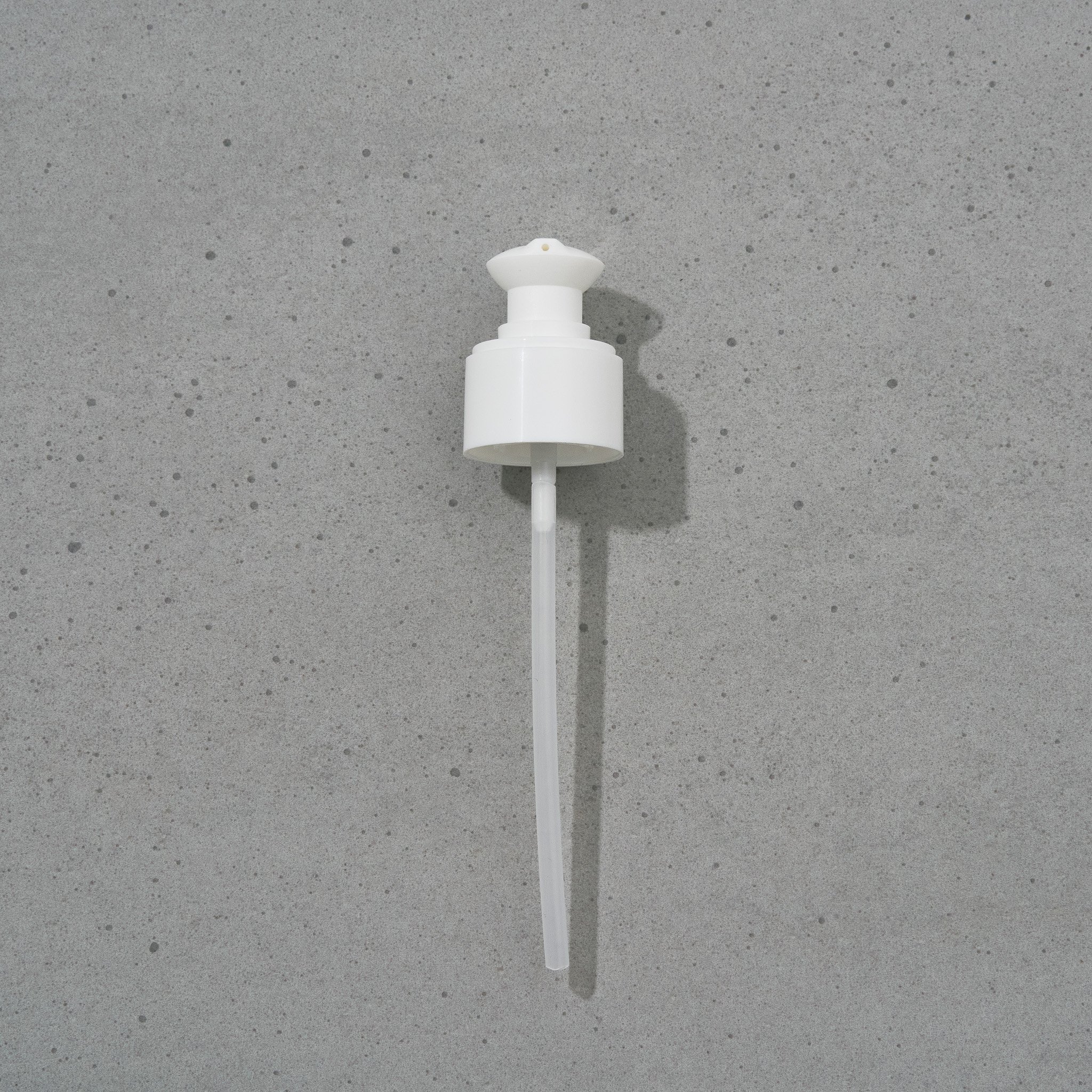
One dispenser, many rituals
Separating the dispenser from the bottle changes a small but familiar habit. Customers choose a dispenser when they need one, then carry it forward to their next bottle, rather than receiving another automatically.
The glass bottle and aluminium cap give each new purchase a simple starting point, while the reusable dispenser offers continuity. The intention is to make keeping something as natural as buying something new.
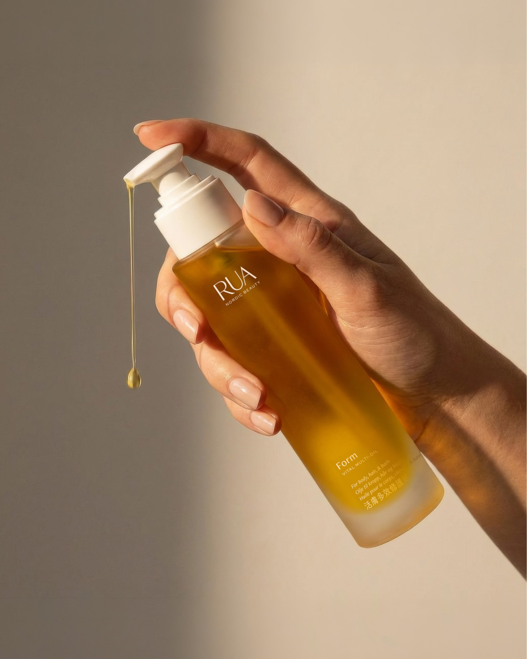
Thoughtfully made. Mindfully kept.
Each bottle begins with an aluminium cap.
The dispenser is purchased separately, then cleaned and reused with the next bottle.
A simple shift that gives a familiar object a longer place in our daily lives.
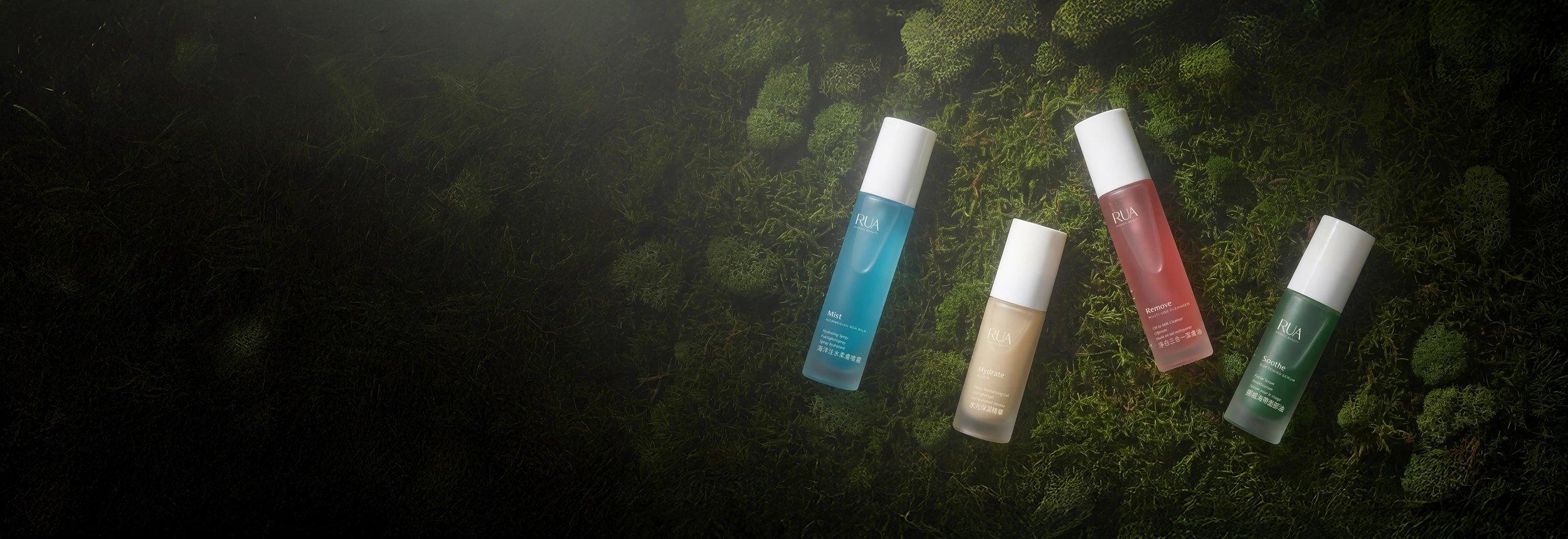
“The design for RUA Nordic Beauty is stunning in how clean, modern, and no-nonsense it is. RUA is unassuming on your shelf, but that’s why you’ll find yourself always drawn to it. ”
— Shawn Binder, Dieline.com
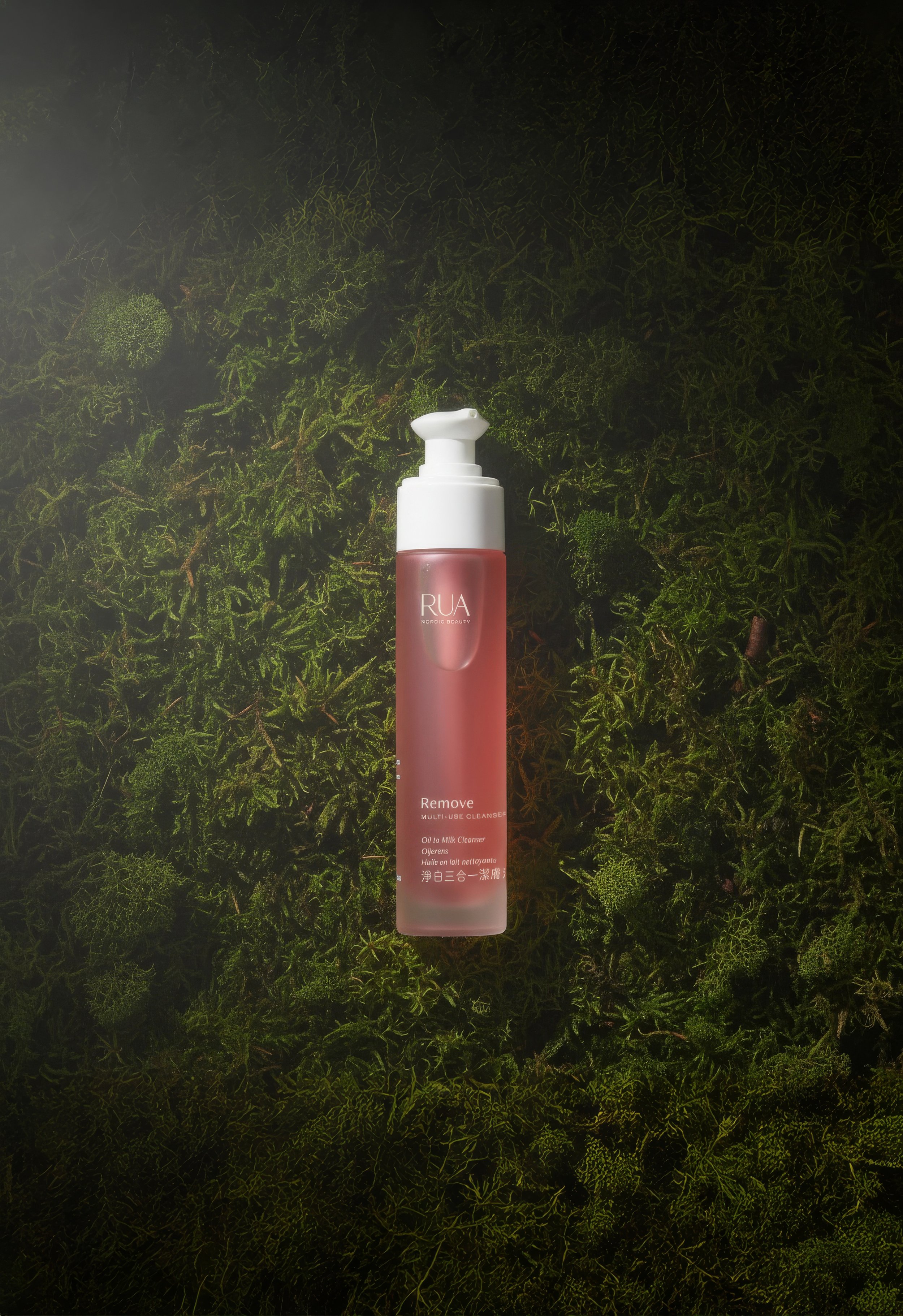

“Working with Giada was a literal dream come true. She took all my ideas, and turned them into a gorgeous reality.”
— Kristina Dunn, RUA Founder & Formulator
you might also like


Let’s work together
Whether you’re a dreamer, a doer, or a wholehearted mix of both, we’ll create the brand of tomorrow — together.
↓